Washington State Ferries
Branding / Layout / Motion Graphics / User Experience
Rebranding a Washington State institution
Washington State Ferries (WSF) has become an icon of the Puget Sound and greater Pacific Northwest region. We rebranded the ferry system with increased commuter ridership as the primary focus and highlighted the reliability and comfort WSF provides.
Problem
Washington State Ferries is currently the only choice for most commuters crossing the Puget Sound. Due to a surge in moving to the city, and those telecommuting from the comfort of their homes, the ferries have seen a decline in ridership. With new, quicker transportation options currently being established, Washington State Ferries needs to stand out as the trusted, reliable mode of transportation it is. WSF has become a recognizable icon of the state, as well as a place of rest for those who commute on it daily.
Goal
Washington State Ferries is a state regulated part of the Washington State Department of Transportation. Branding for something on this level needs to feel trusted and reliable, but also live as a part of the community.
Solution
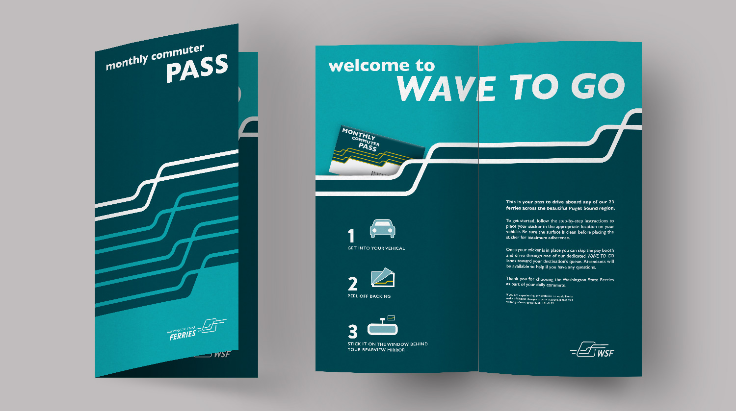
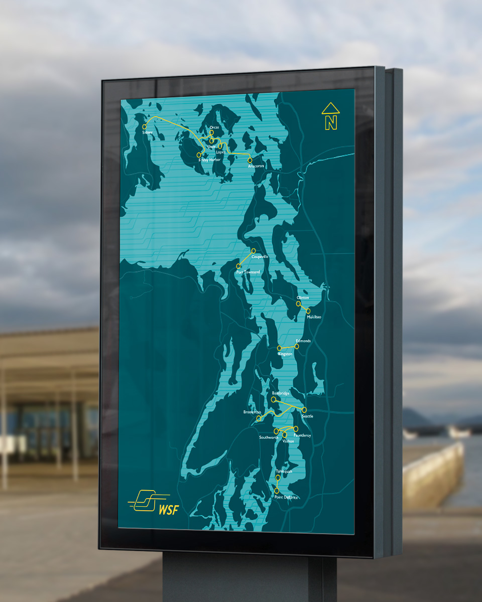
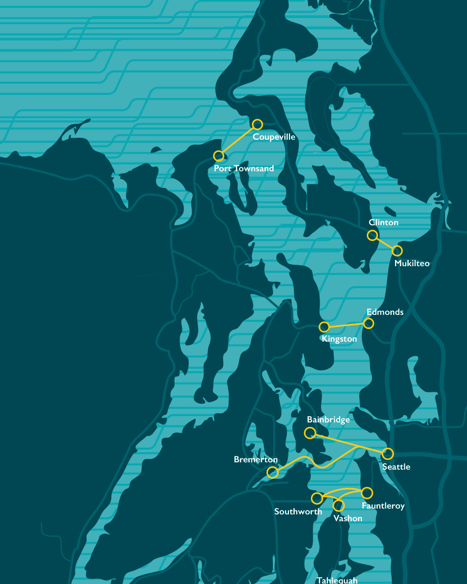
Washington State Ferries needs a rebrand that feels trustworthy and governmental without alienating those who see it as an icon of the Puget Sound. The brand also needs to remind riders that they can come and relax on the Ferry during there commute, without worrying about traffic. We created a brand that focuses on the journey, that highlights the ferry itself and nods to the relaxing experience you will find aboard.
My Roles
Logo design, layout, typography, motion design, UX, interface design, art direction, strategy
Tools
Adobe Illustrator, Adobe Photoshop, Adobe After Effects, Adobe InDesign
Duration
10 weeks
Collaborators

Brand Identification Process
WSF built its brand and its reputation by providing over 55 years of safe, reliable, convenient, and affordable service to cross-sound travelers.
Currently, WSF branding is focused on its history of safe, reliable, and affordable service.
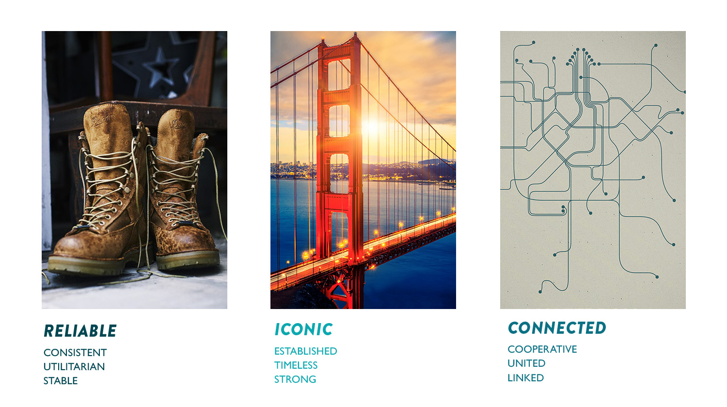
To understand the client, we performed an brand audit. This helped us define what the brand is and is not both visually and conceptually. This process boiled down the Washington State Ferries into their brand pillars: Reliable, Iconic, and Connected.
Brand Pillars
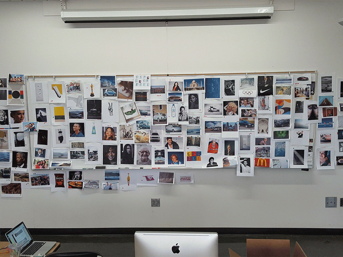
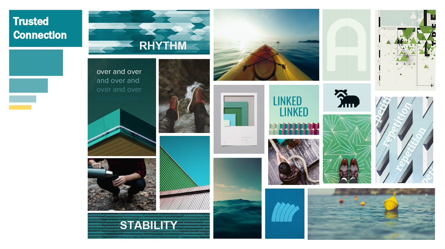
Visual Concept Board
Logo Exploration + Meaning
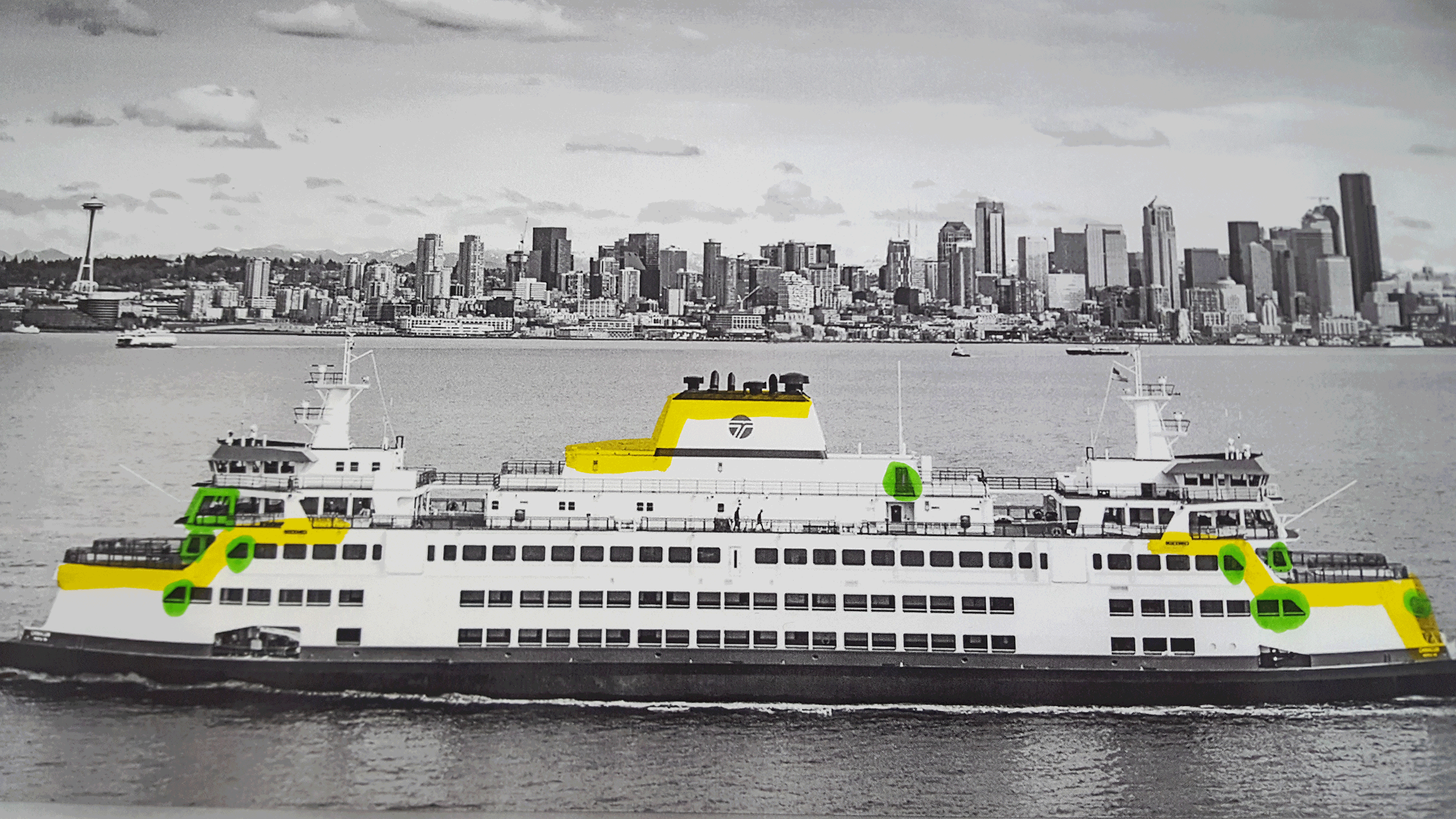
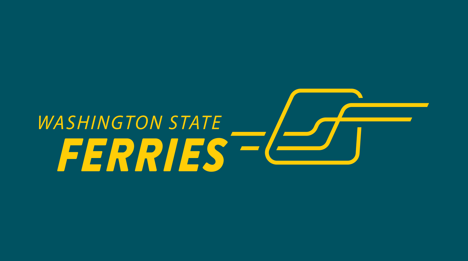
Created out of two elements, the Washington State Ferries brandmark is simple enough for a child to recreate from memory while still unique enough to be immediately identifiable. The elements used are directly inspired by the ferry’s physical structure but also hint at many of the character traits held by the Washington State Ferries.
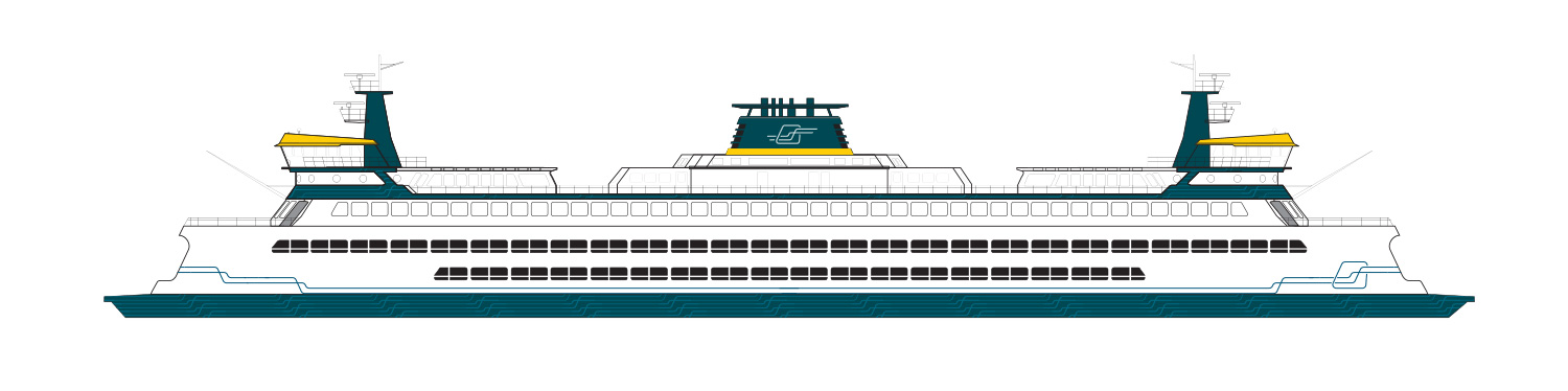
The primary element is the window. A recognisable shape, it is distinctly from a seafaring vessel and many of this form can be found aboard the Washington State Ferries vessel fleet. With its asymmetric forward lean and friendly rounded corners, this element perfectly captures the visual tone and structure of the Washington State Ferries.
The secondary element is the intersecting lines that travel through the window element. These lines were derived from several sources of inspiration: the silhouette of the ferry’s profile geometry as well as the picturesque and unique landscape of the Puget Sound region. The lines symbolize connections made across the water and forward movement from one physical location to another. The lines create a visual relationship between that which is outside and that which is inside.
