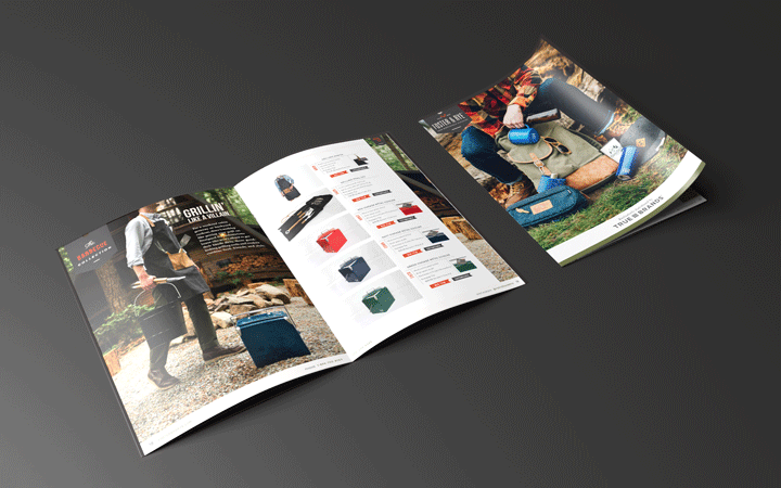
Foster & Rye 2018 Wholesale Catalog
Art Directing / Layout / Photo Styling / Print
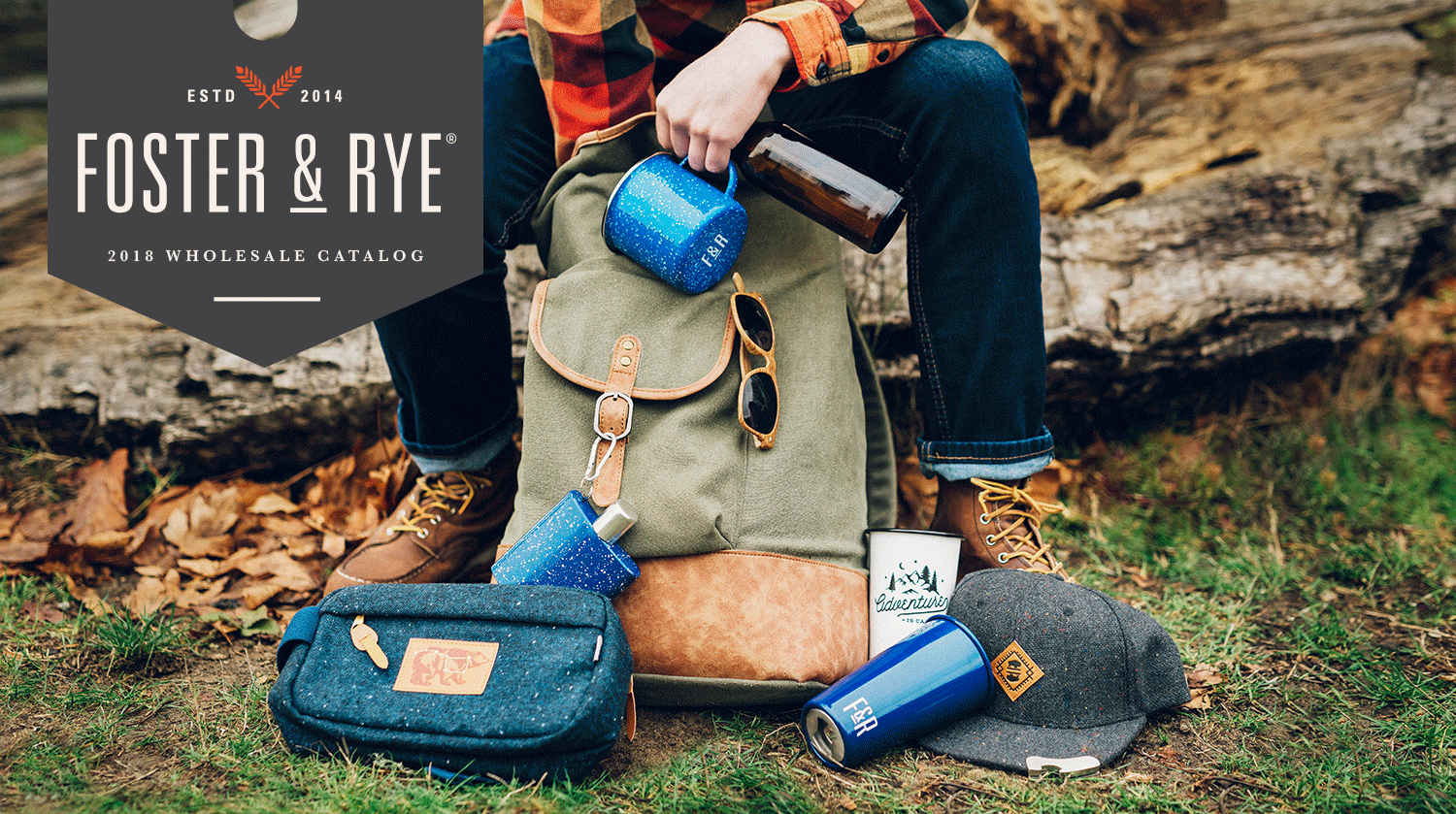
Adventure Every Day
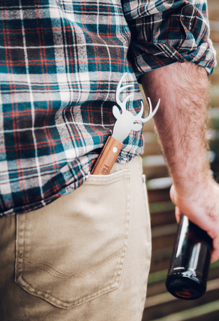
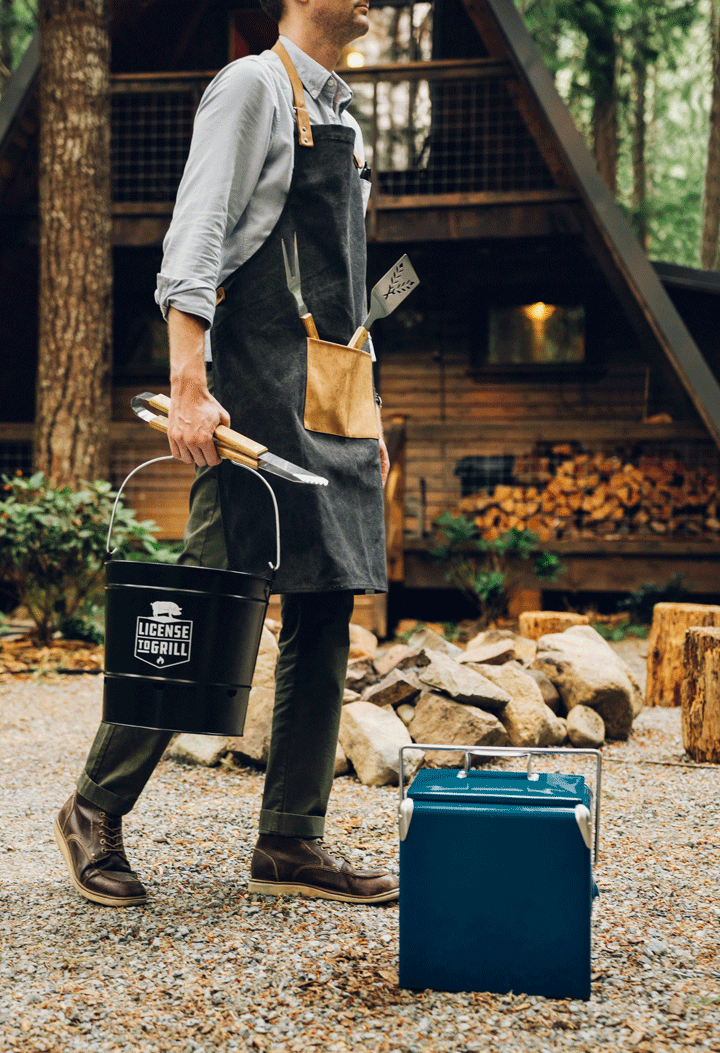
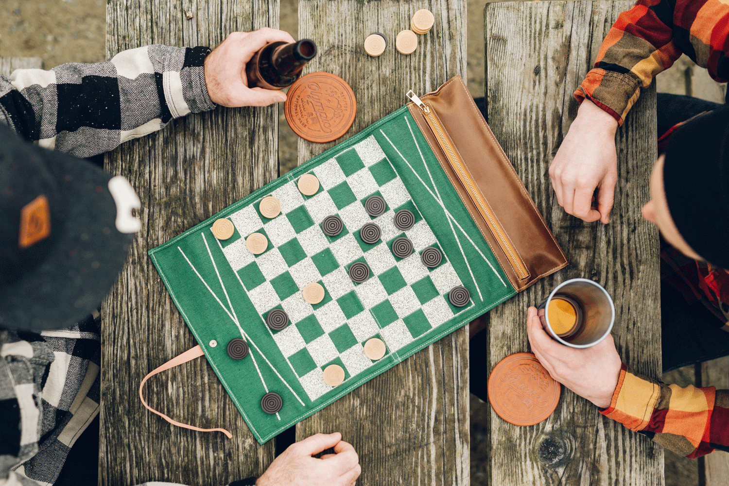
Foster & Rye is about making bar accessories for the outdoor adventurer. They develop unique products for men out of raw materials made to inspire. I created the 2018 wholesale catalog with the purpose of capturing the mood and feeling the of the brand while showcasing its products.
Updating the Catalog
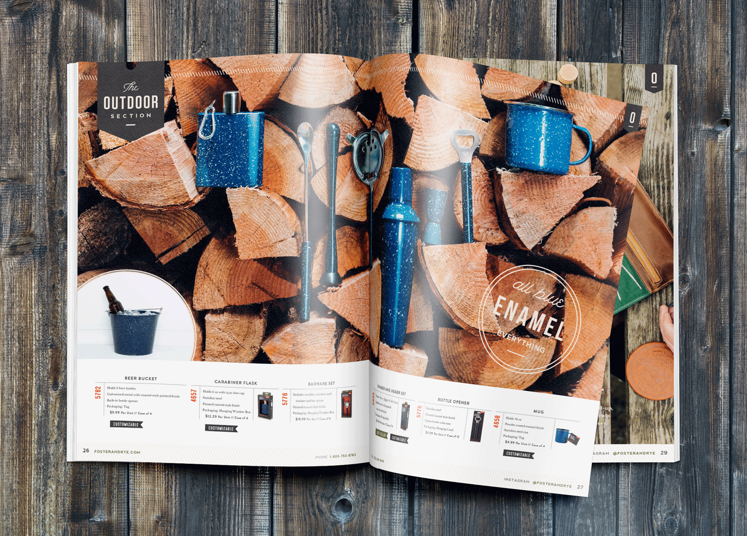
True Brands wanted to feature new products and remove those no longer available. 42 new products were added and 6 collections were curated to show cohesion in a catalog that previously had very little. I implemented an expanded organizational system to provide readers with a brand friendly experience while highlighting key products.
My Roles
art direction, layout, typography, photo conception, photo styling
Tools
Adobe InDesign, Adobe Illustrator, Adobe Photoshop
Duration
2 months
Collaborators
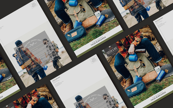
The Catalog
Photography
Photography Process
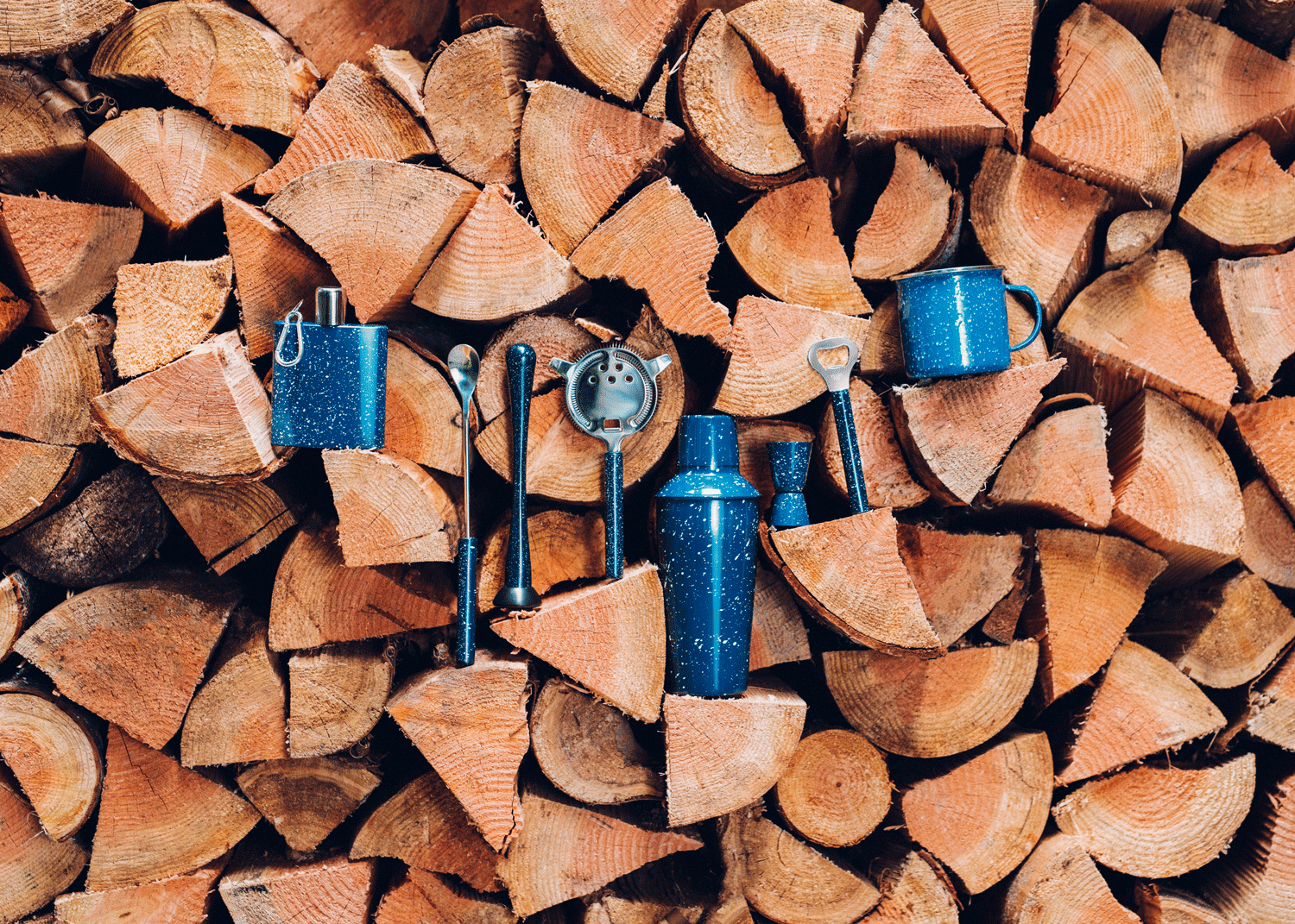
I wore many hats throughout this catalog process. Needing strong photography to sell the brand, I was asked to concept photos, create visual mood boards for each photo, compile the items needed for each photo, and art direct the photoshoots. Here is an example of the moodboard to photo to final layout.
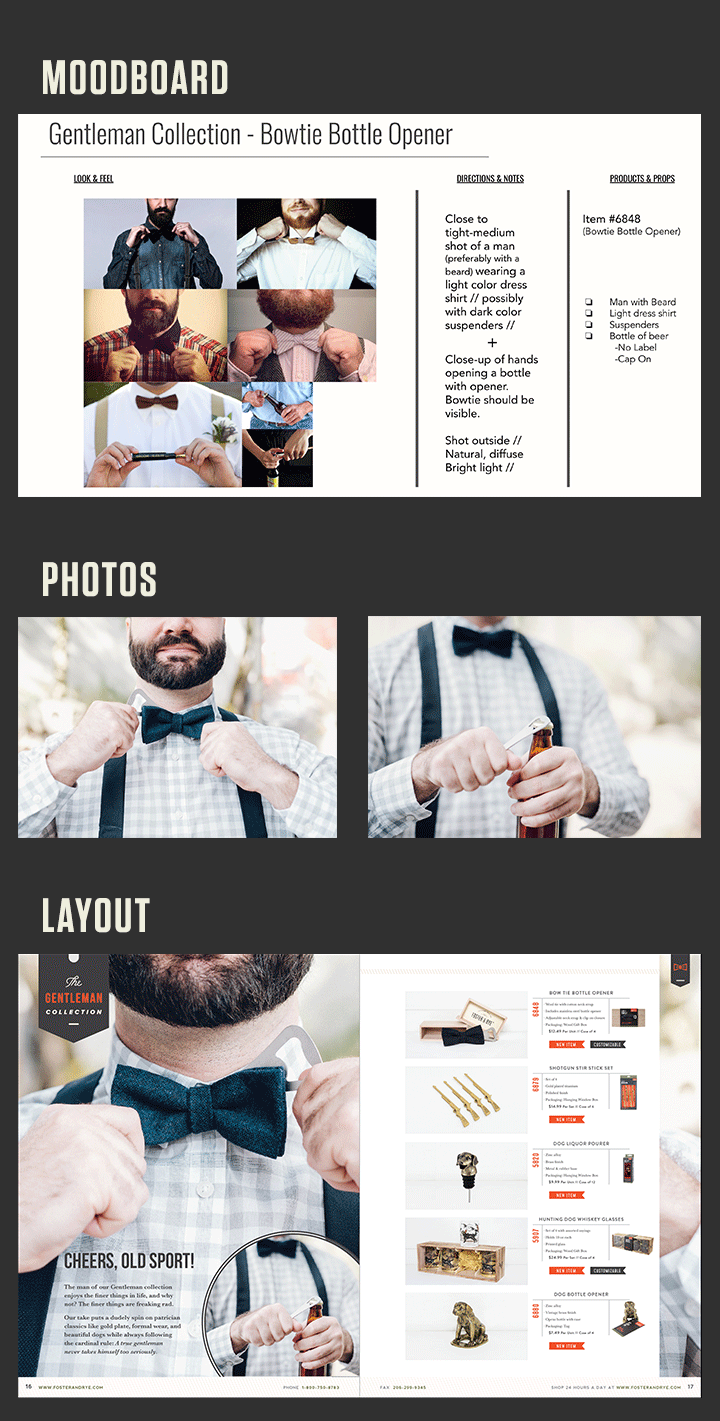
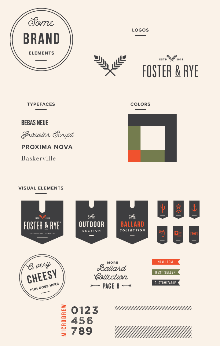
Visual Language
Type is important in conveying visual tone. Per the brand guidelines, most of the type choices were made already. However there were some cases wherein I needed to make type choices the felt brand appropriate. Headlines are in Tungsten and Bebas Neue, Subheads are Proxima Nova, and Body copy is Baskerville. Call out puns are (from top to bottom) Growler Script, Tungsten, Proxima Nova.
Consistent visuals to help guide the reader are important for providing a smooth user experience. New sections are called out with large ribbons, paired with smaller ribbons. Collections and Sections are delineated by use of color and simple illustrations. Call backs for double faced items are visually similar to the Call Out puns; these command less attention while feeling visually similar.
Layout & Grid
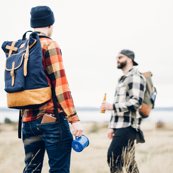
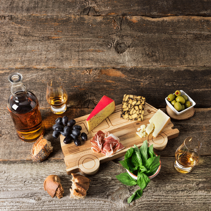
Selling the brand through visual storytelling meant allowing space for large, aspirational photography. Most spreads dedicate an entire page to a full bleed image which allows the viewer to see themselves using the products that are featured.
On the opposite page are not only the products shown in the feature image but also include other similar items to tell a cohesive story. The paired semi-environmental images and item descriptions align to the 12 column grid and remain consistent from spread to spread.