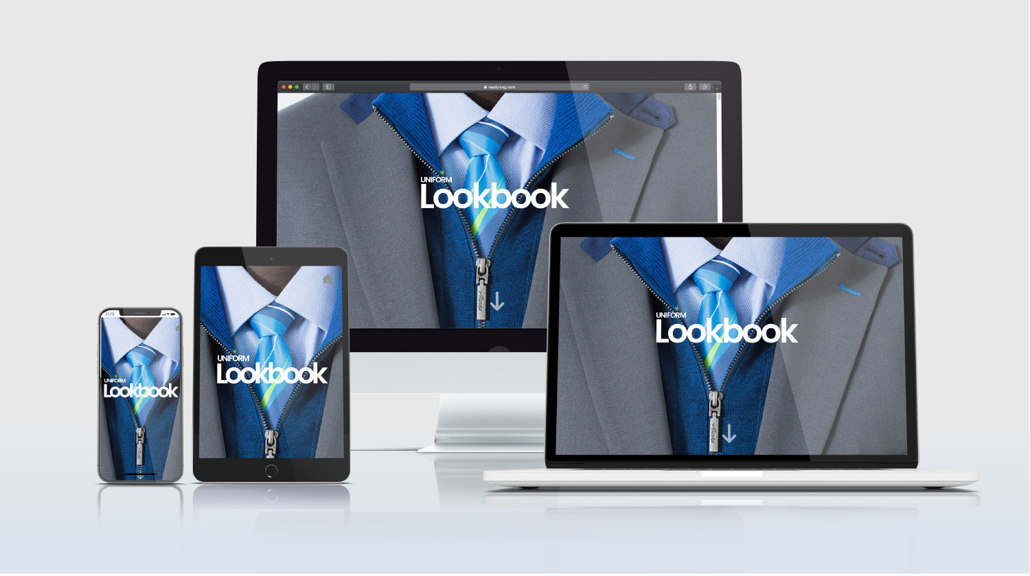
Alaska Airlines Digital Lookbook
Art Directing / Digital / Layout / User Experience

Digital design all dressed up
With the successful execution of the uniform lookbook in print, a digital version was quickly requested. Alaska Airlines employees are now able to digitally scroll through the lookbook from any device.
Problem
The lookbook was initially requested as a print-only deliverable. After its release and the overwhelmingly positive feedback we received, I was asked to create a digital version that mimicked the print version.
Goals
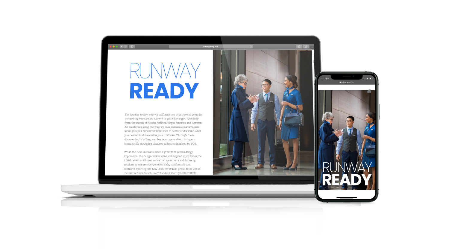
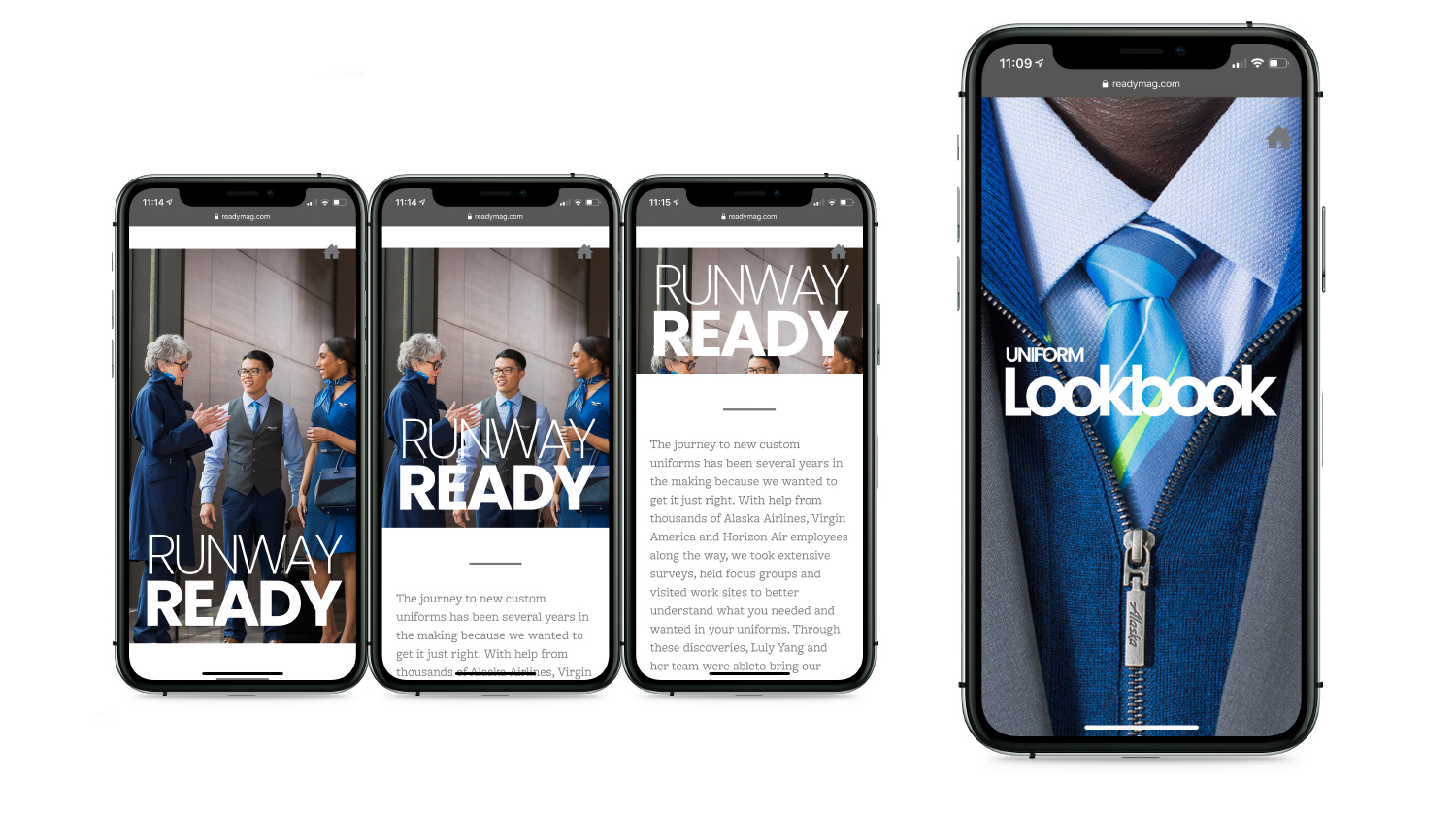
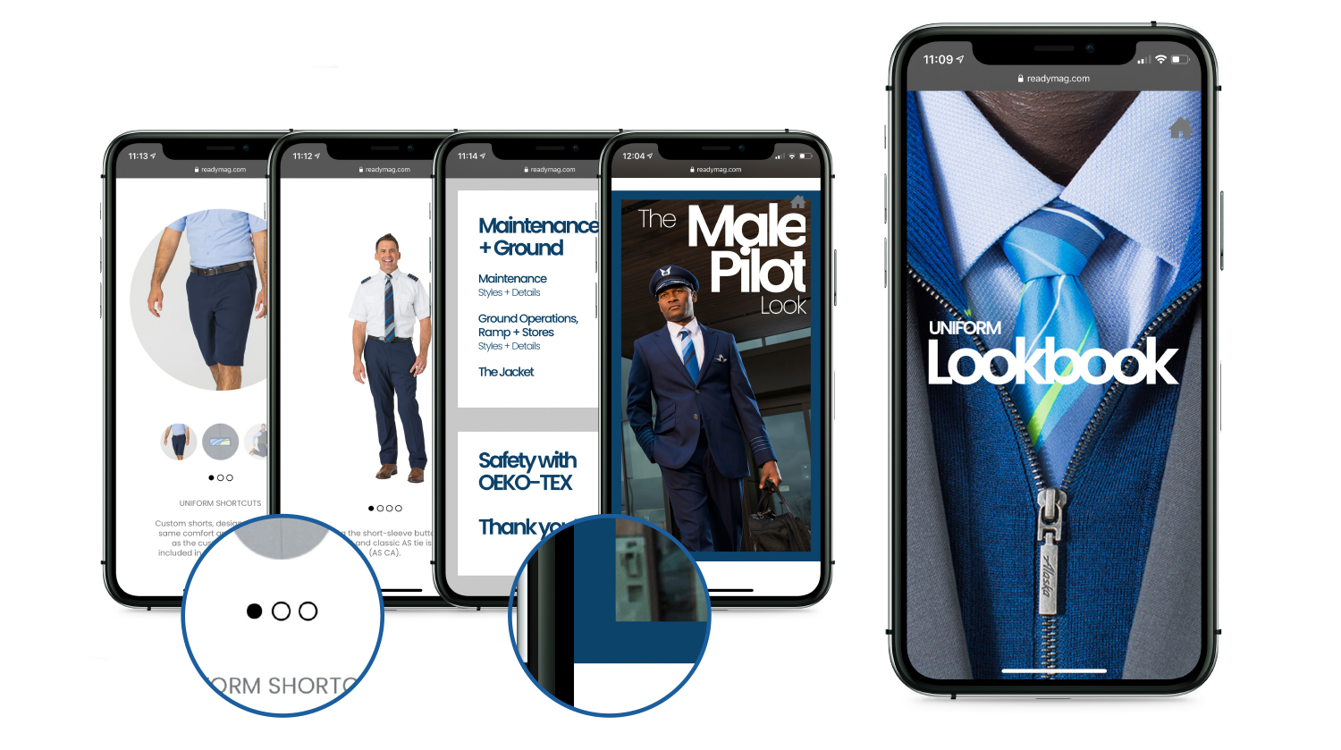
To create a digital version of the uniform lookbook that looks and feels like the print version. This version should be accessible to all employees on a variety of digital platforms (desktop, mobile, tablet).
Solution
I offered three options which I ranked as GOOD, BETTER and BEST.
- GOOD—re-layout the print version from spreads to pages and create a PDF which can be downloaded by employees. (2 days)
- BETTER—Utilize a platform that requires no developers but allows design freedom (1 month)
- BEST—Partner with a developer to create a stand alone site dedicated to the digital lookbook (3 months)
Advocating for an elevated design experience while prioritizing time efficiently, we decided on the BETTER option.
My Roles
layout, ux design, ui design
Tools
ReadyMag, Adobe Photoshop
Duration
4 weeks
Collaborators
Photography—Ingrid Barrentine
Copy—Sara K. Runnels
Research & Design Notes
I watched tutorials on how to navigate and design on the ReadyMag platform and investigated other sites powered by ReadyMag. This helped me get inspired and showed me what was possible on this platform.
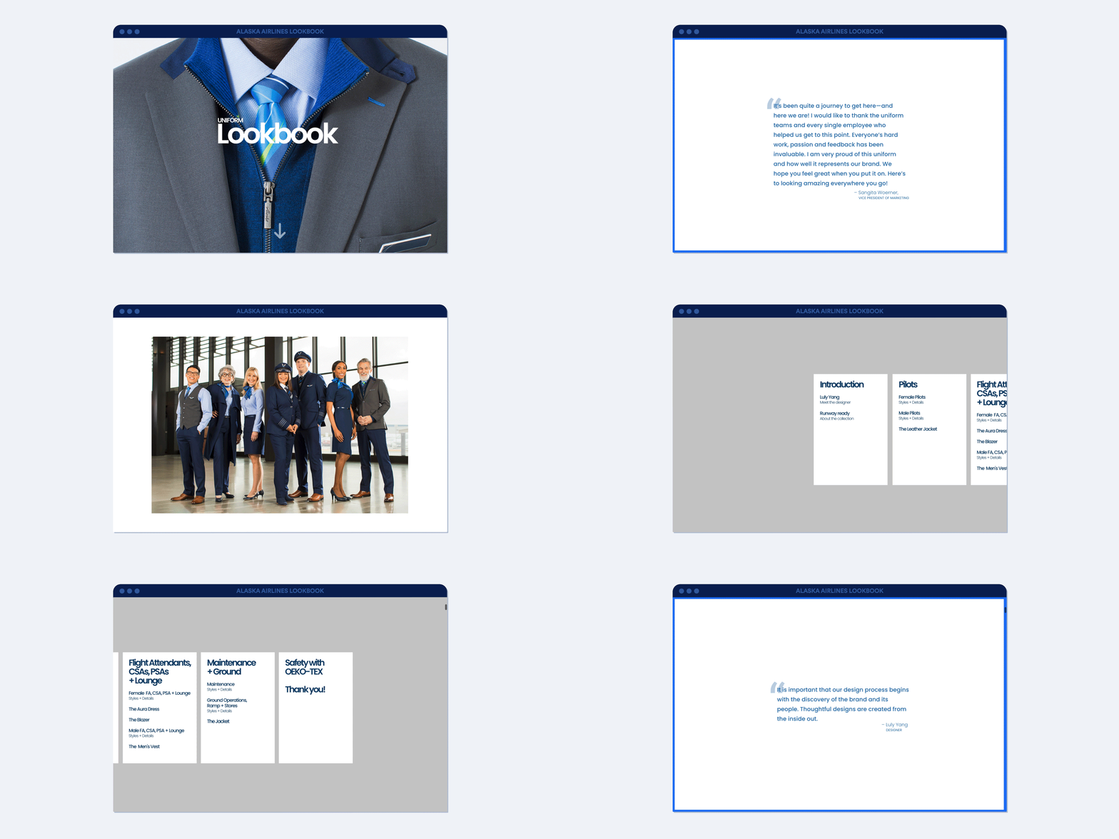
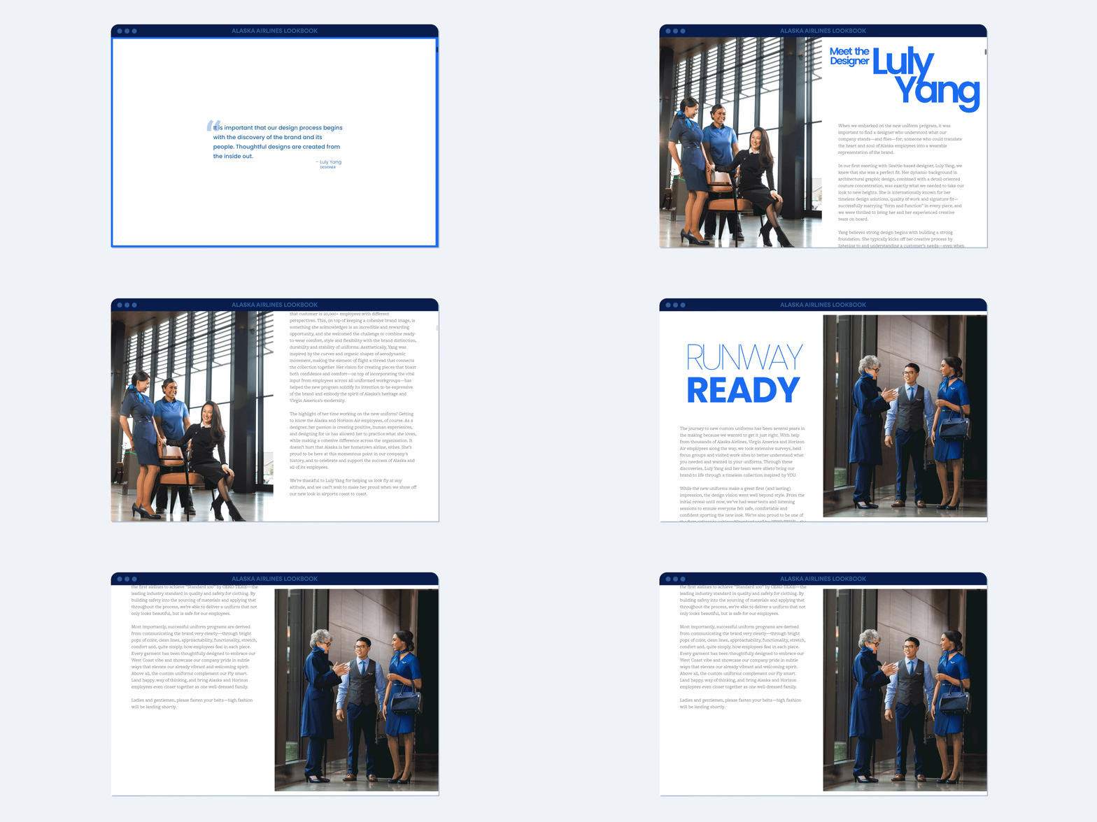
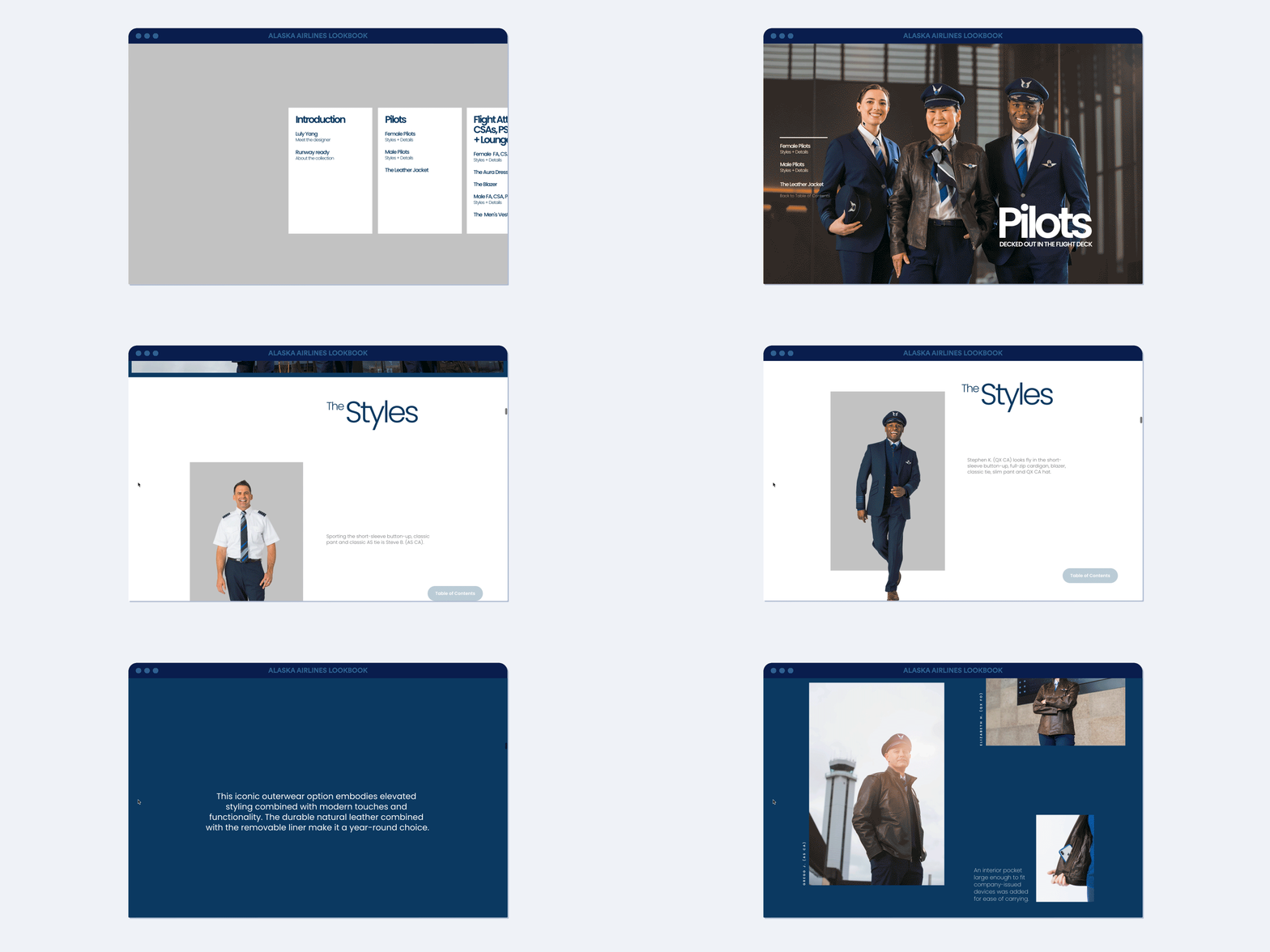
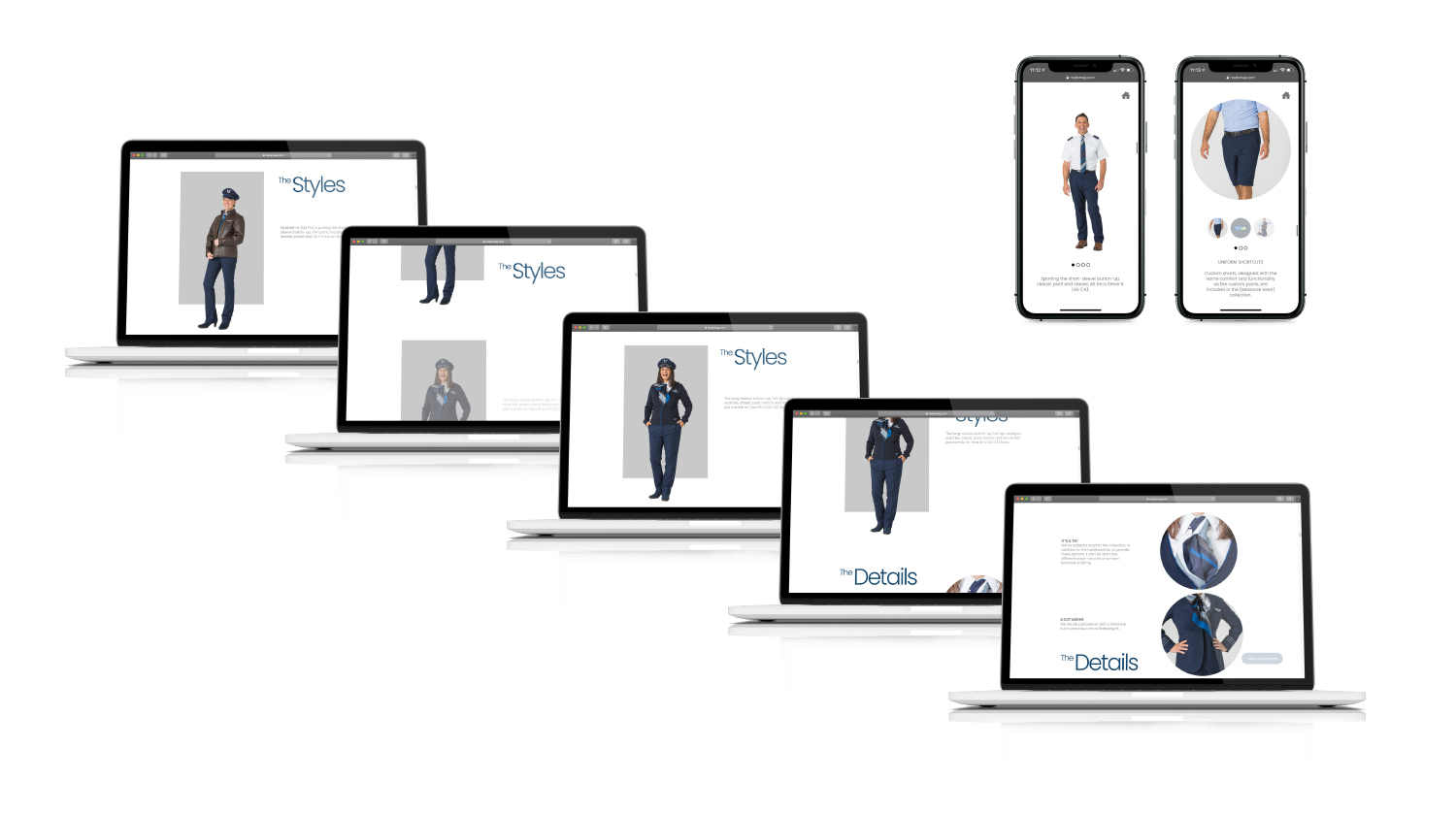
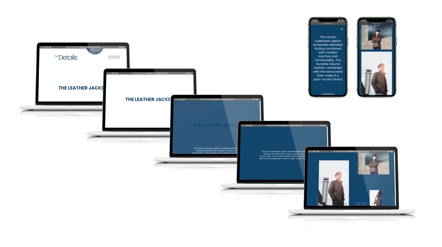
I used many full-viewport elements to mimic the feel of physical pages. I included visual indicators to help the user understand where they are within the lookbook, similarly but not exactly like the print version. for example, the main workgroup sections (e.g. Pilots) are full-viewport with a section specific navigation on the left. Gender specific pages (e.g. The Male Pilot Look) feature a midnight-blue boarder without navigation. Style sections, as in the print version, have individual employees blocked with a gray background; while Details sections contain free floating or circular imagery. Most visually different are the featured item sections (e.g. The Leather Jacket) wherein the background fades from white to midnight-blue. This striking visual emphasizes these sections and highlights additional imagery for each featured item.
One challenge I ran up against was keeping a consistent and user friendly navigation system. I created a side-scrolling section with a unique gray background to act as a table of contents with a persistent button that would navigate the user back to this section. It’s an imperfect system but give users some sense of adjacency and agility while navigating.
Below are a mockups of some sections the digital lookbook experience.
