Doe Bay Fest
Advertising / Branding / Illustration / Layout
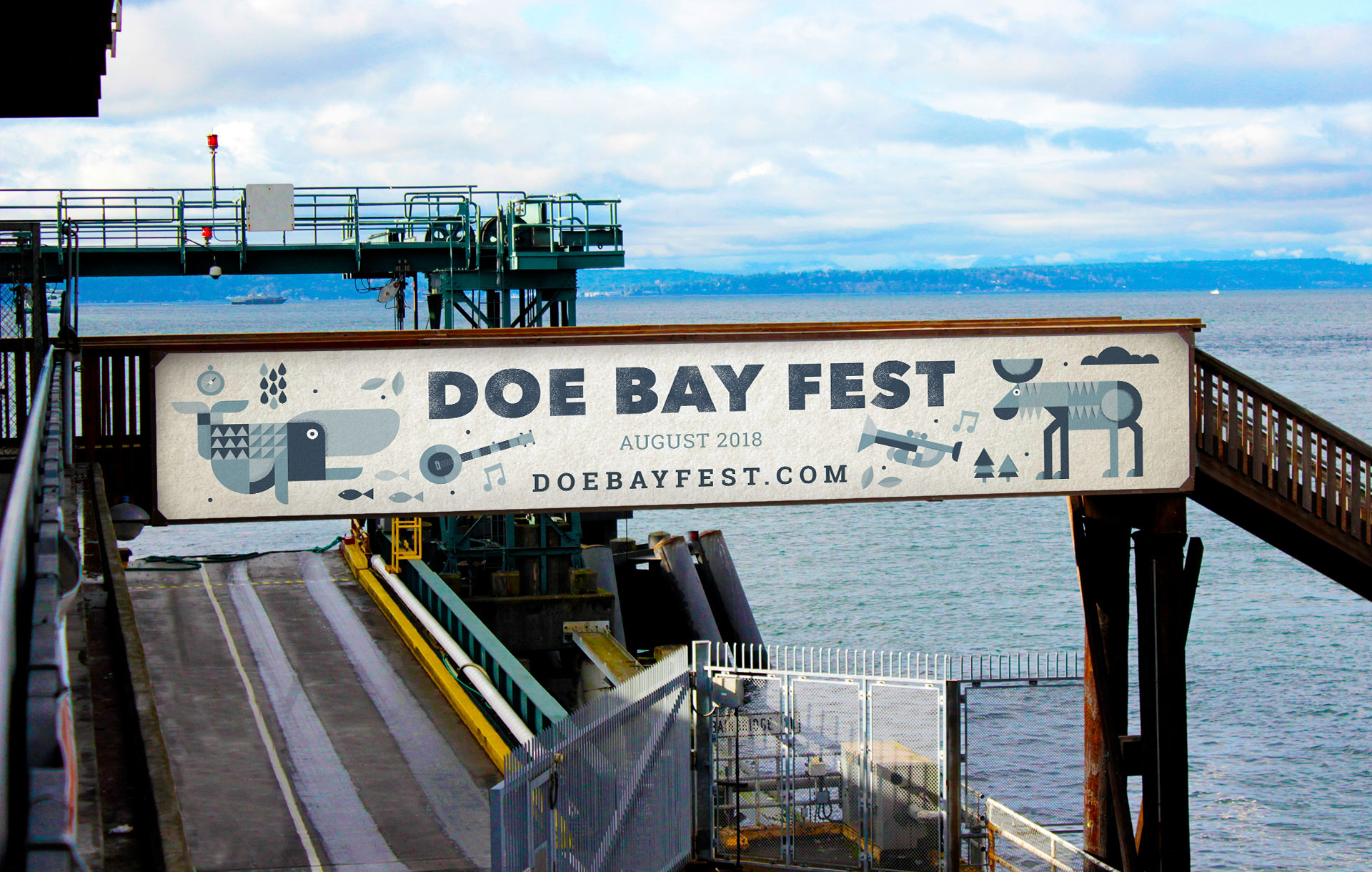
A summer music festival like none other
Doe Bay Fest is a four-day grassroots festival featuring music, food, drink, camping and activities in the unique setting of the Doe Bay Resort and Retreat.
Overview
Many people love Doe Bay Fest for the camaraderie, the gorgeous surroundings, and of course for the music. Unfortunately, Doe Bay does not currently advertise nor do they have a cohesive design guideline. We wanted to create an appropriate advertising campaign for Doe Bay Fest 2018 that feels true to the festival as well as the Doe Bay Resort and Retreat.
The demographic of attendees are mainly Pacific Northwestern’s between the age of 21- 40 who enjoy live music and the outdoors. This primarily includes those who have been to and enjoy Doe Bay, while also being tapped into Northwest music culture. These people are proponents of nature and the environment, but also live a modern lifestyle.
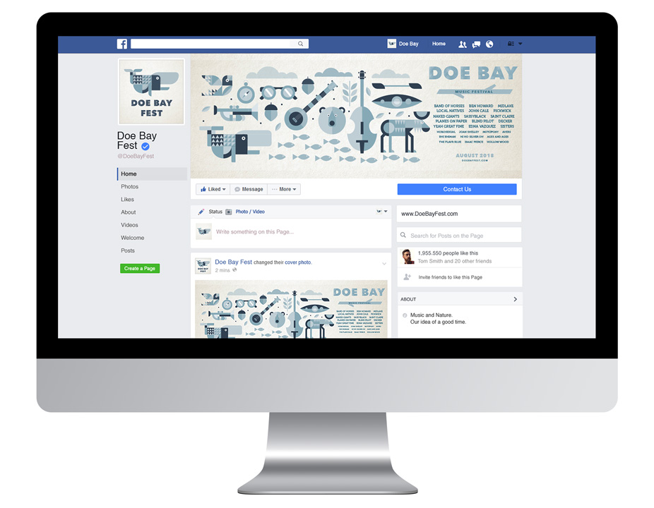
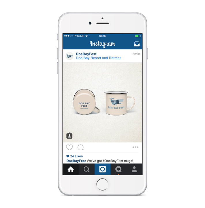
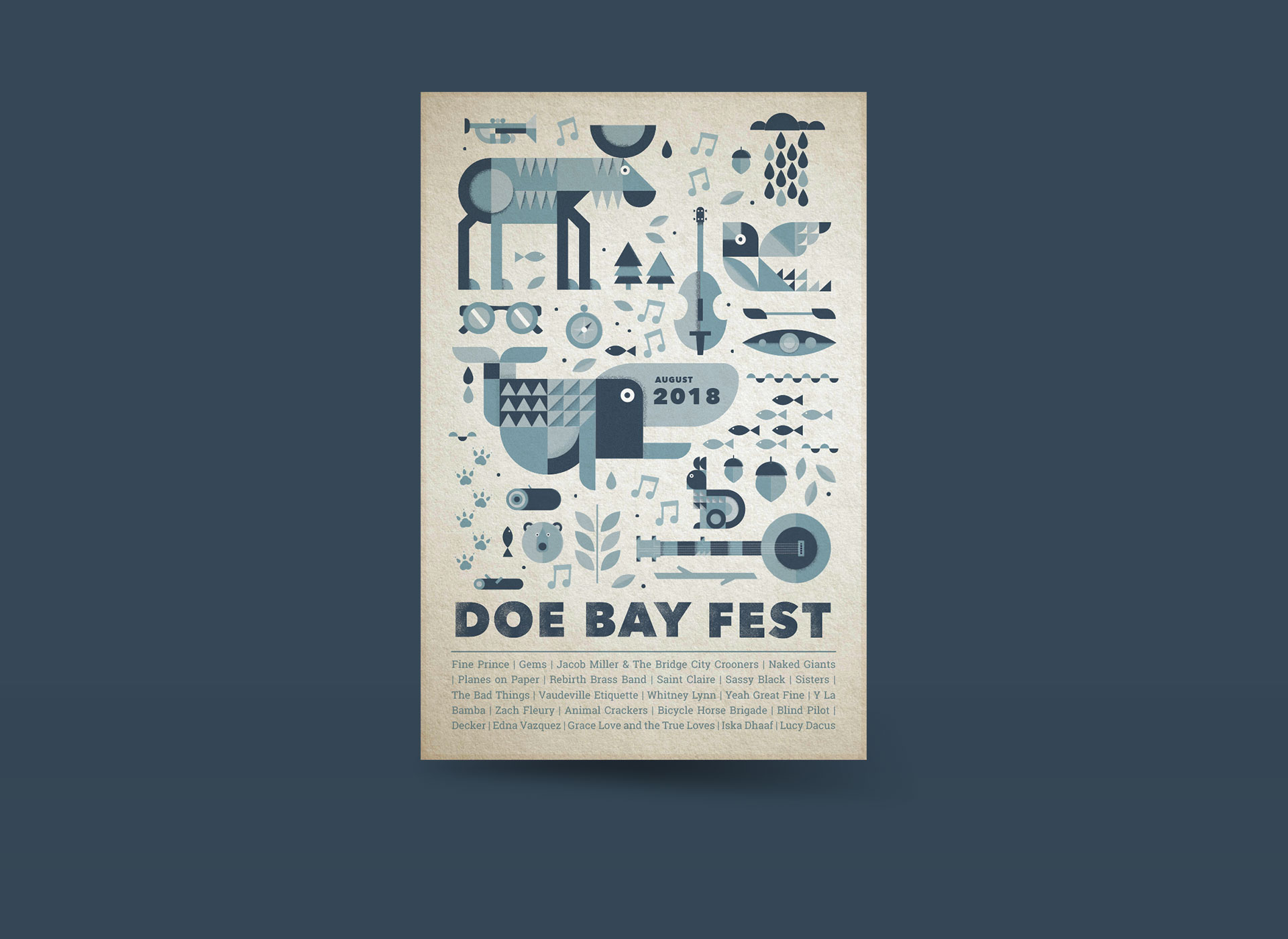
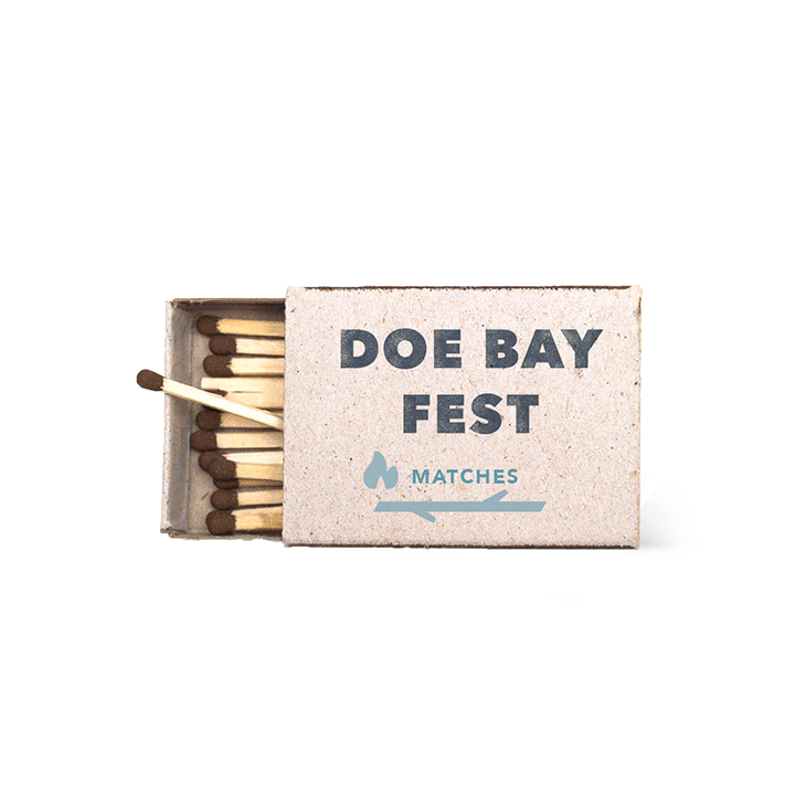
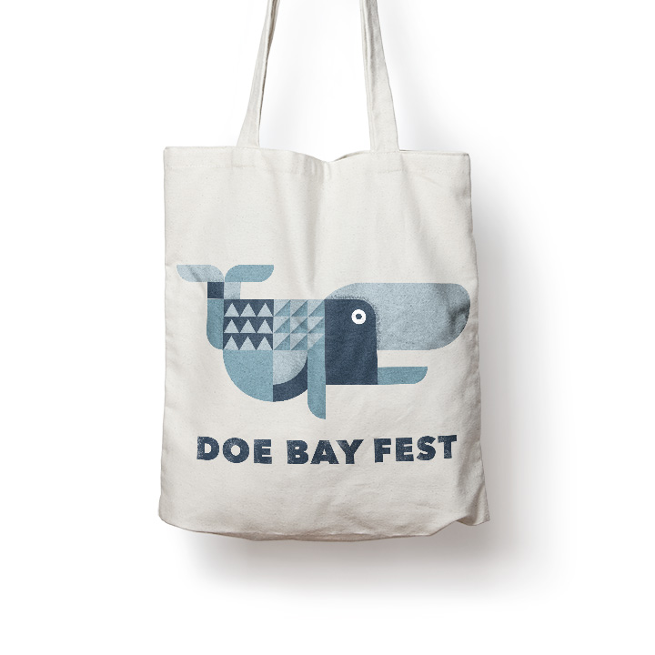
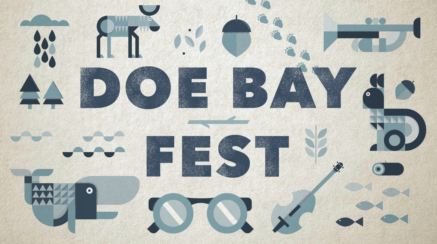
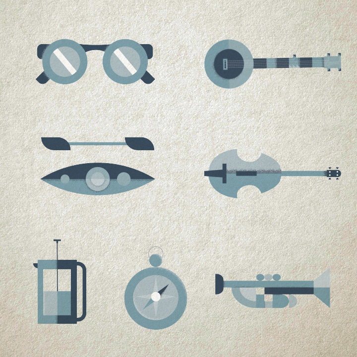
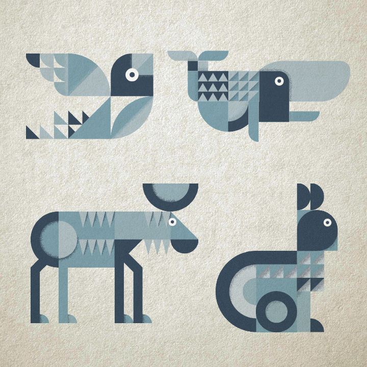
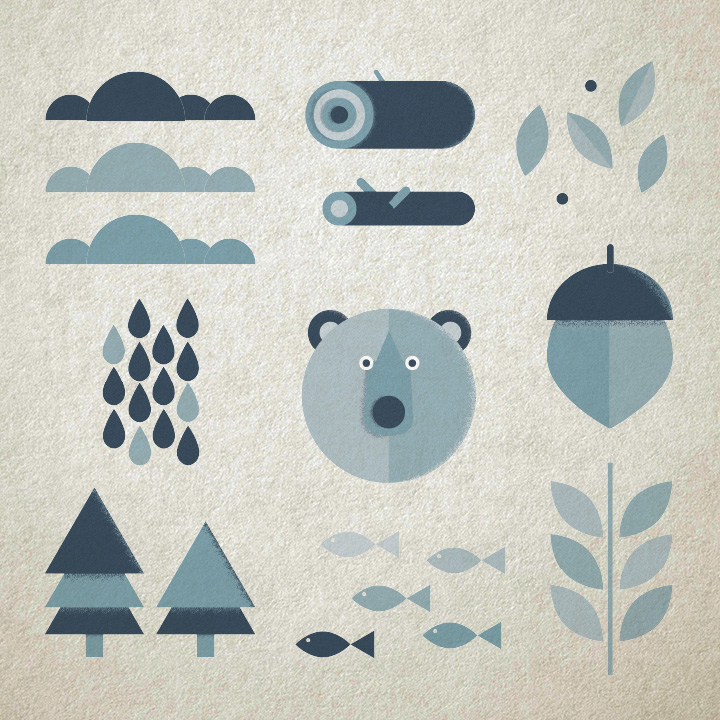
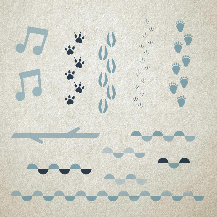
Our design system included the creation of modular illustrative components that can be used interchangeably throughout various pieces of collateral. These illustrations have a cohesive tone giving Doe Bay and its festival a strong voice. Our campaign includes strategic print advertisements, scalable guerilla marketing, and physical collateral to be sold in a store both at the festival as well as online.
My Roles
Research, concept, visual design, illustration, advertising & marketing
Tools
Adobe Illustrator, Adobe Photoshop, Adobe InDesign
Duration
5 weeks
Collaborators
Logo + Color Palette
Visual Style
We chose to use a distressed Avenir Heavy for the main logo paired with Roboto Slab. Both typefaces are geometric in nature which perfectly mirrors the geometric illustrations they accompany. They are strong, easily read typefaces which make for getting information at a glance. These work perfectly for advertising.
Our moodboard features a combination of both distressed texture and geometric, modular illustration style. The texture bring an organic feel that perfectly represents the tone of Doe Bay while the geometric illustration keeps everything simple. Doe Bay is all about the simple things, so breaking down elements found in and around Orcas Island to their simplest shapes hits at the easy mood Doe Bay brings.
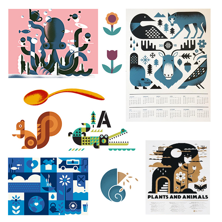
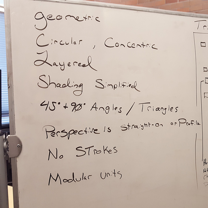
Visual Audit
Ian and I both created illustrations for this campaign. In order to be consistent with our illustrative style we performed a visual audit of our moodboard. We examined specific consistencies found across the mood and complied a list of these similarities.
When creating a new illustration we would cross-check the stylings with our visual audit list to see if there were any inconsistencies or opportunities to push the illustrations further. This helped keep our style the same regardless of who was illustrating.
Illustrations
Advertising Collateral