Koko: Subscription Service for Dog Owners
Advertising / Branding / Digital / Layout / Motion Graphics / Packaging / User Experience
A dog food brand that's so much more than dog food
Koko (Finnish for “whole” or “entire”) is a subscription service for dog owners based on the Finnish Baby Box.
Problem
There are too many options for pet foods and services in the current market. Pet owners are getting frustrated and overwhelmed by having to research the best food, insurances, and products.
Goal
Create a simple and straight-forward Online eco-system for pet parents to access an all-in-one subscription making caring for their dogs a hassle-free process.
Solution
Koko establishes and emotional connection with costumers through engaging copy, fresh visuals, and simple user experience. By partnering up with local urban dog clinics, shelters, groomers, and dog-walkers, Koko creates an easy way for costumers to care for thier dog. koko is a playful, simple, and trustworthy brand that guides costumers through choosing the best products specific to each dogs health needs.
My Roles
Packaging Design, Advertising, Layout, UI Animation, Brand Development, Art Direction
Tools
Adobe Illustrator, Adobe Photoshop, Adobe After Effects, Adobe InDesign
Duration
6 weeks
Collaborators
Concept
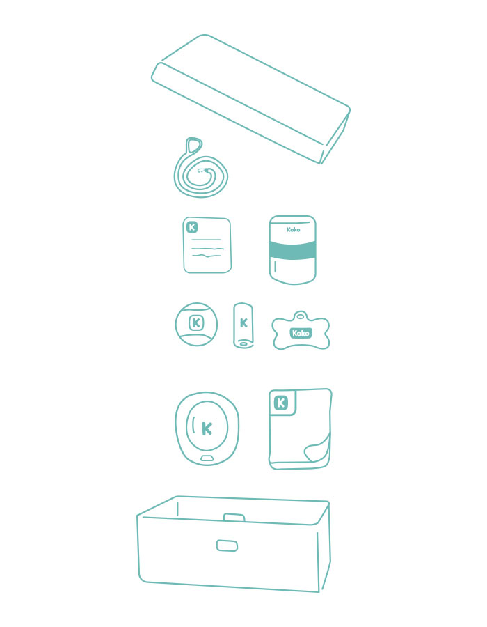
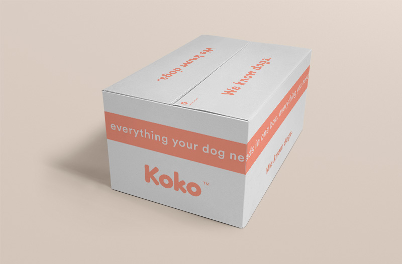
Koko is a Finnish word meaning “whole.” We chose this name because we felt it perfectly distills the core concept for our entire brand. Our main inspiration for Koko is the concept of the Finnish Baby Box. In Finland, when someone has a baby, the government sends a box of essential baby products as a starter kit for a baby. The box has everything a new parent needs to successfully parent a newborn. Koko is the Finnish Baby Box for dogs. Koko sends a box to each person or family with a newly registered dog at any of partnered locations. The box includes enough dog food to last 2 months, toys, a blanket, a leash, a collar, and an info booklet explaining everything Koko offers. The bottom of the box is even cushioned so it can also be used a temporary bed for puppies and smaller dogs. Sending this box with new dog owners not only establishes an emotional connection with our customers from the beginning but develops trust in our brand as well.
Koko takes care of dogs throughout the span of their life. We created specific meal plans tailored for each dog with monthly subscriptions including access to partnered services like; pet groomers, adoption clinics, veterinary offices, and dog walking services.
Koko makes owning your first dog easy. We do the research so you don’t have to.
Who is the Koko Customer?
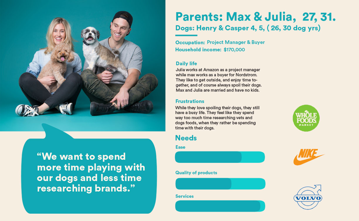
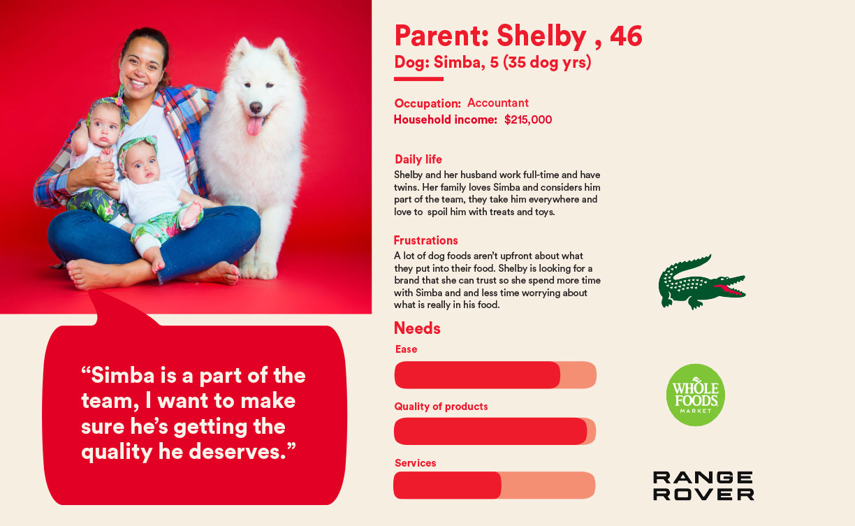
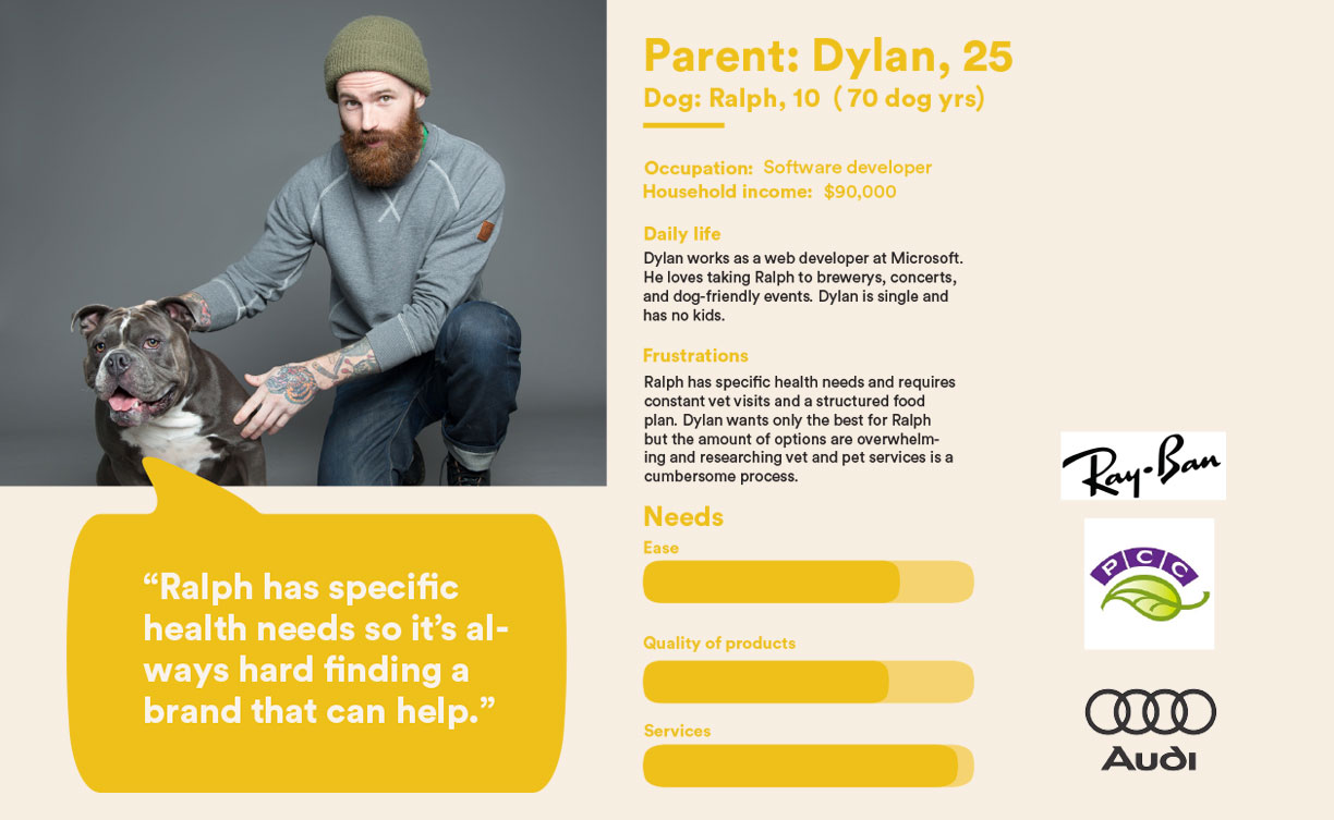
Koko’s targeted demographic are families and single-pet owners who, above all else, consider their dogs as members of their family. This being a premium service, our demographic likely earns 80,000+ per year. They are busy professionals that love to spoil and pamper their dogs, but often get frustrated with the overwhelming amount of options for pet services and products. At the end of the day they want a something they can trust so they can spend less time worrying, and more time playing.
Process
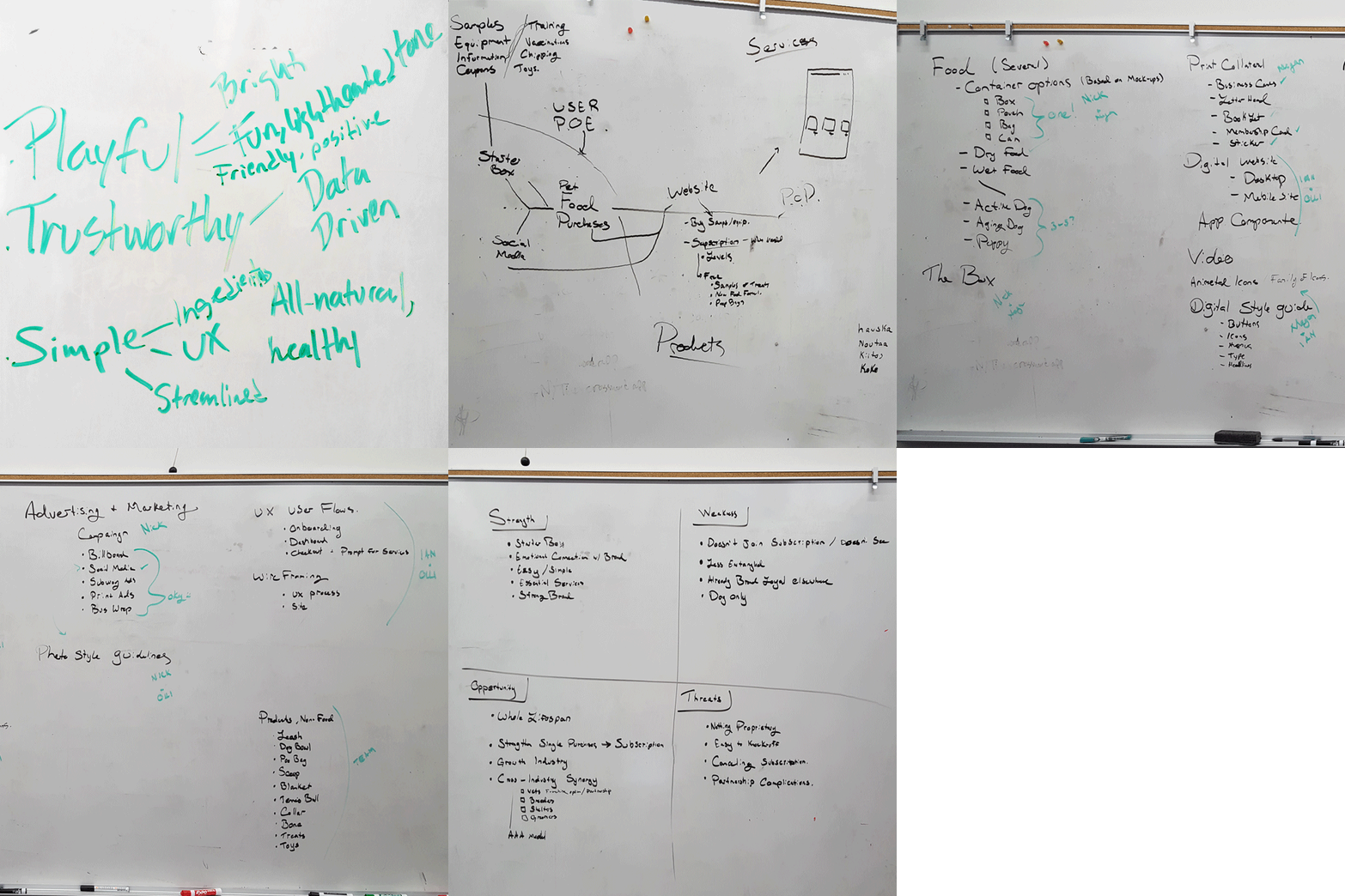
We began developing our brand by first establishing how we want our customers to think and feel about Koko. These ideas, thoughts, feelings, and values would become our brand attributes. We discussed and wrote down words we wanted Koko to be associated with; keeping in mind the full customer experience our users would have. After narrowing down and grouping our word associations, our core brand pillars became clear.
We wanted Koko to be and feel:
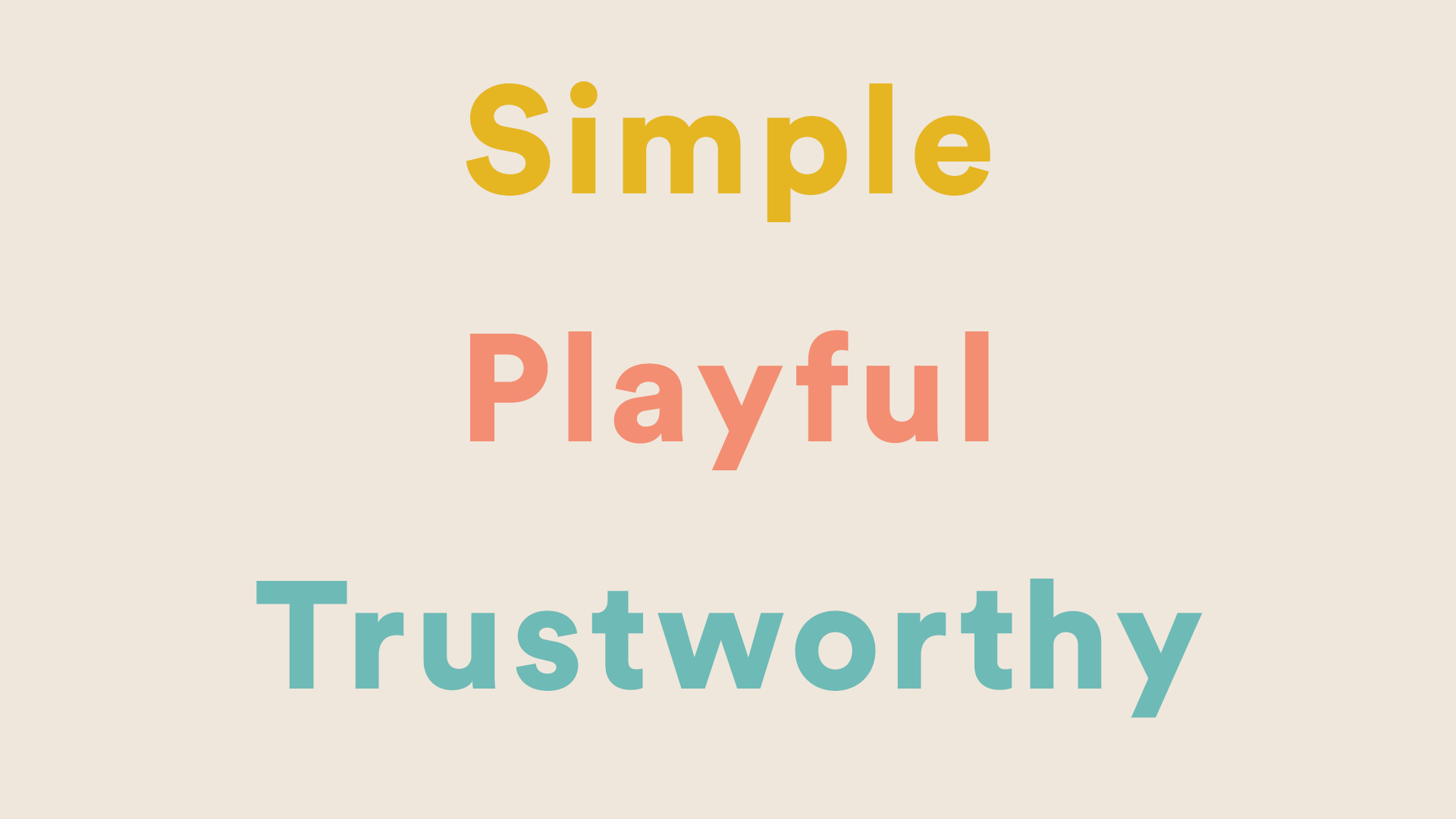
- Simple
- Playful
- Trustworthy
Simple interactions and ingredients: from the UX/UI to the perfectly crafted meals and treats. Playful packaging, imagery, and illustrations to keep the fun of owning a dog incorporated throughout. Trustworthy tone and feeling throughout the entire customer journey.
To further understand our users, we sketched a WSOT analysis and customer journey map evaluating the marketplace, user needs/pain points, and customer entry points.
Identity
Koko’s visual language is important.
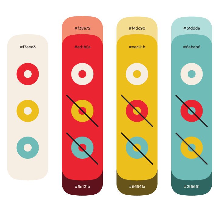
The color pallette is a playful take on a split complimentary that includes red, yellow and teal. To expand our palette we included both a lighter and darker component. These colors are anchored by a calming cream base hue that pairs well with any of these colors. We created a chart that displays all the appropriate and non-brand-friendly colors combinations. This brand agreement made color combination choices easy for everyone without having to discuss the appropriateness of each combination at every iteration of the collateral creation process. Note that neither black nor white are included on this chart as they should only be used when absolutely necessary.
The type is Circular Std which is inherently built on the grid, which gives its a trustworthy foundation, but contains a playfulness that melds perfectly with our brand.
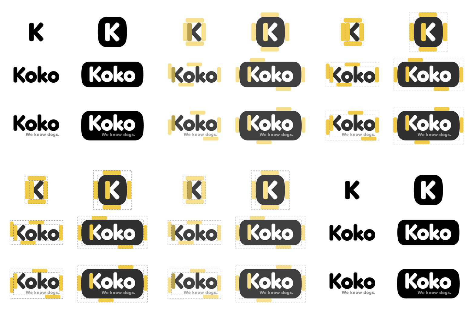
The logo is created using a modified version of Fredoka One. The thick strokes and stubby, rounded terminals perfectly combine the simplicity and playfulness we want our brand to be.

Products
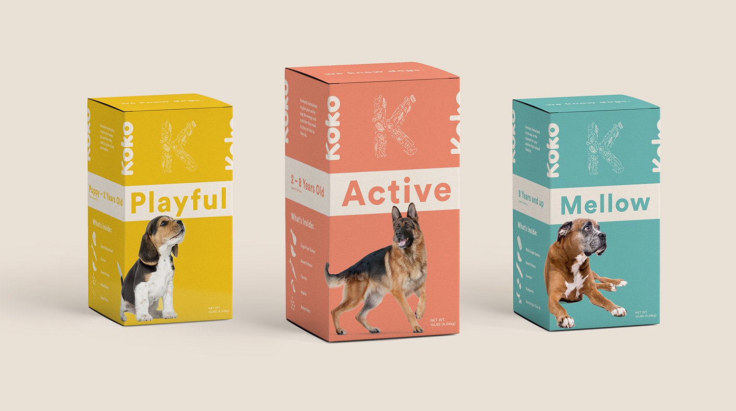
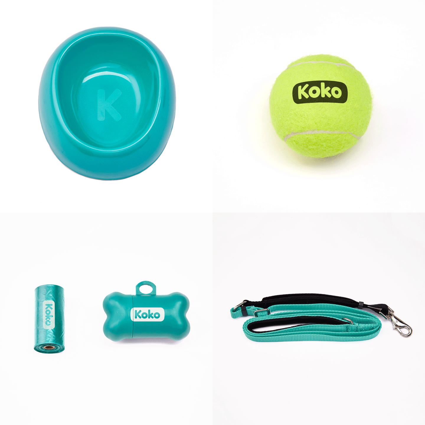
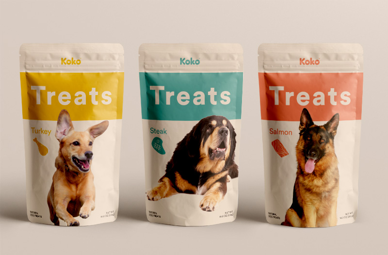
Keeping our brand attributes in mind, we implemented our color palette showing a visual difference between our dog foods.
Specially with our dog food, we wanted to use copy that was approachable and identifiable with our audience. Using words such as “playful” instead of “puppy” and “mellow” instead of “senior” helps to develop an emotional connection with our audience.
The illustrations on the packaging act as playful visuals educating the customer on what exactly is inside Koko food.

Advertising
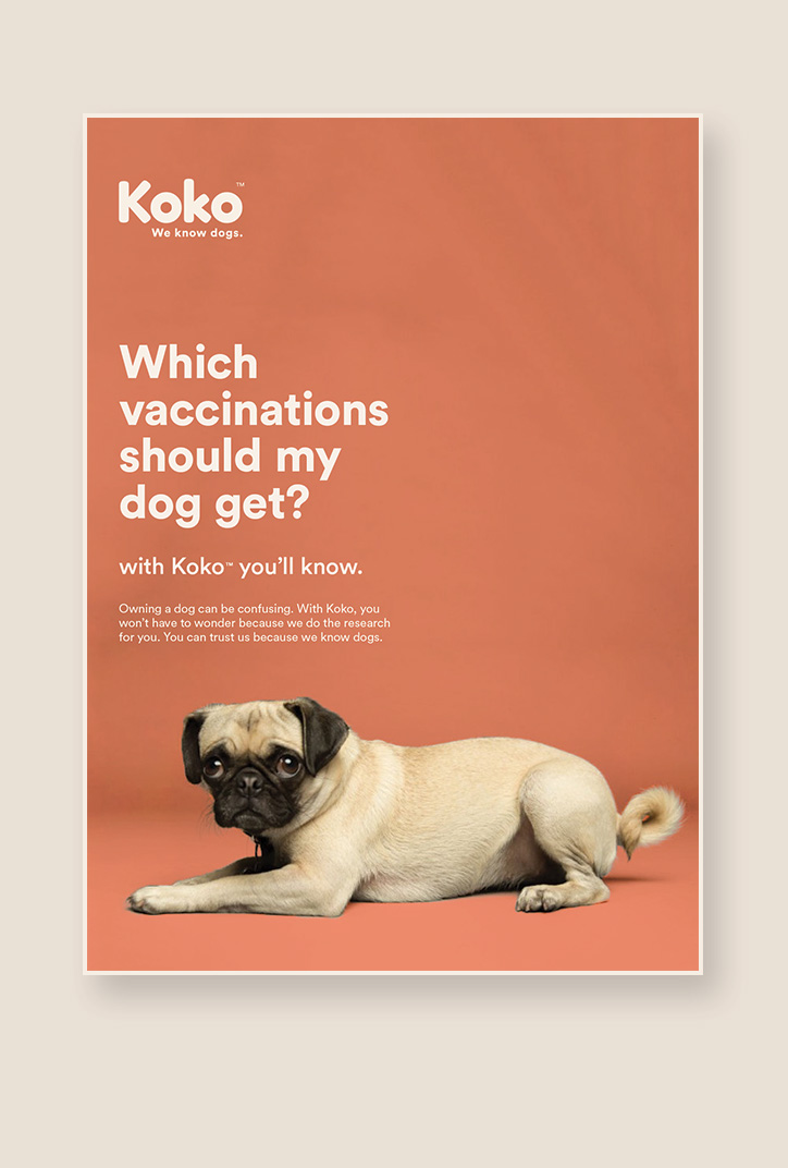
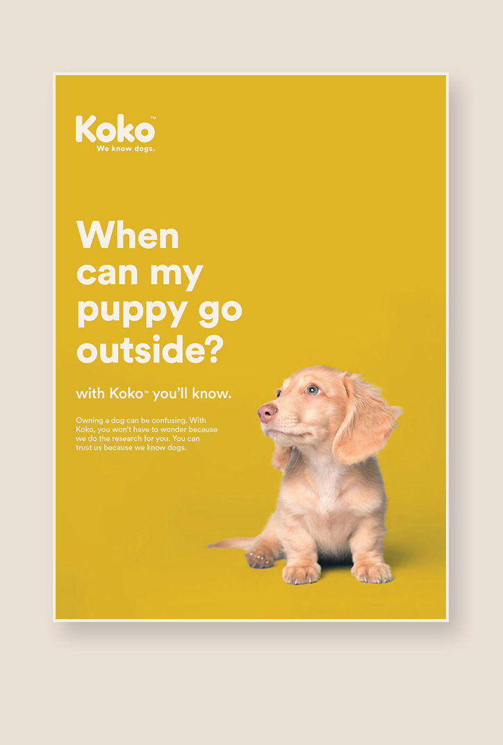
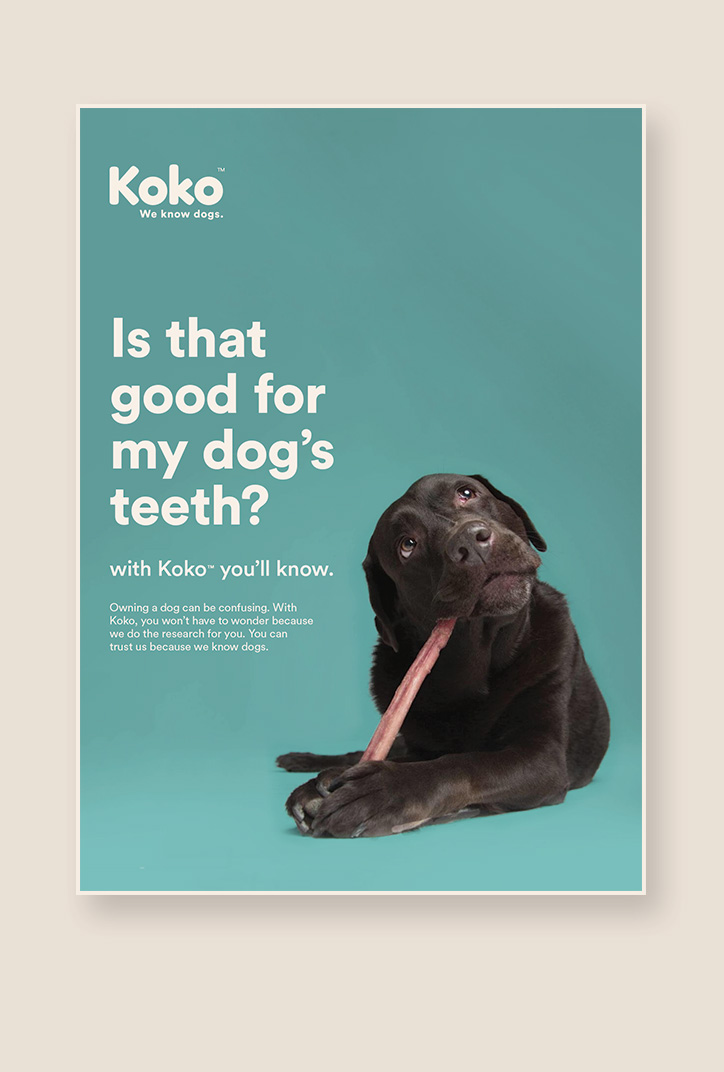
When creating the our advertising campaign, we wanted to focus on real questions new dog owners have. There is so much information and misinformation out there that people get confused and are unsure what information is real.
We researched commonly asked questions on popular pet chat forms and found ones that were passionately discussed. Most topics revolved around which foods are okay for dogs and which are toxic. Many had to do with health and veterinary services.
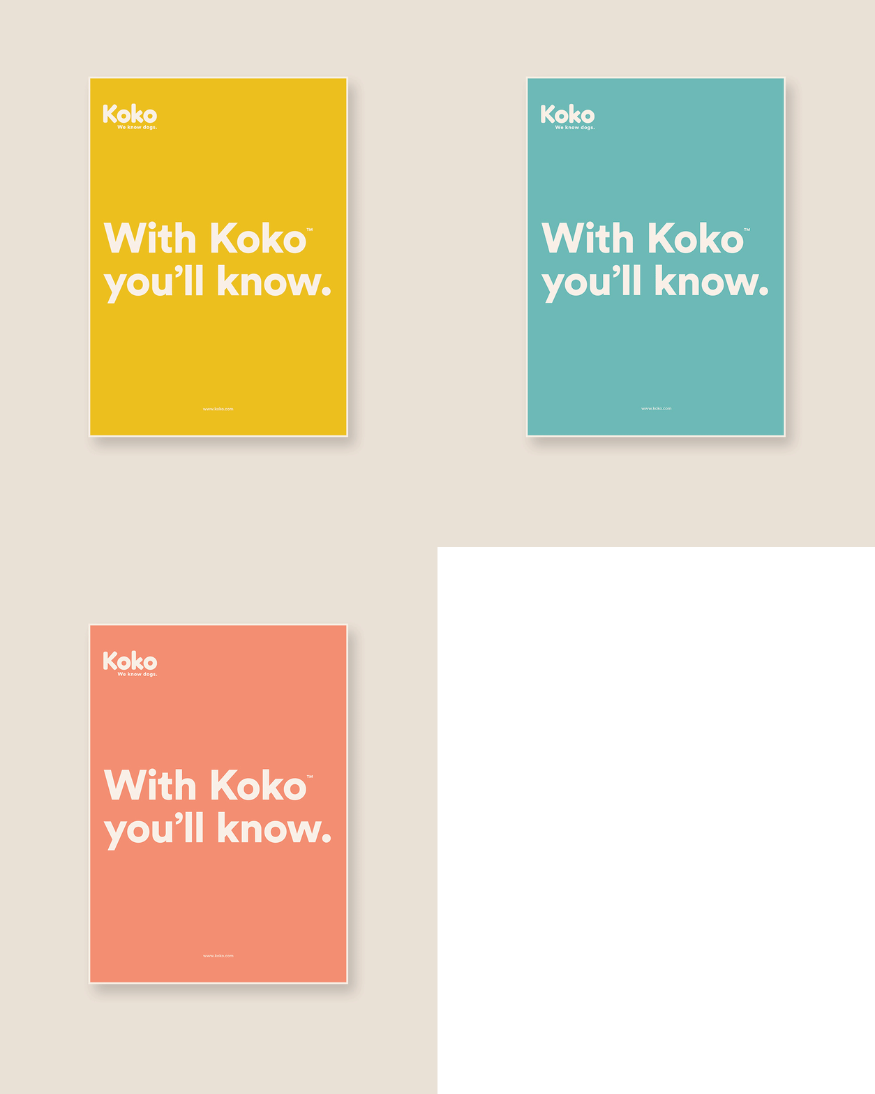
Adding the punch line “With Koko You’ll Know” assures pet owners that they won’t have to worry about these things because Koko has done the research for them and they can trust us to know what is right for their dog.
All dog owners want to provide the best for their dogs, but knowing what is best is hard. The power of our campaign is that we seek out and takes advantage of that vulnerability dog owners feel when they are unsure.
