Friends making cider making friends
Wild State Cider is a cidery located in Duluth Minnesota focused on bringing together friends who love the outdoors.
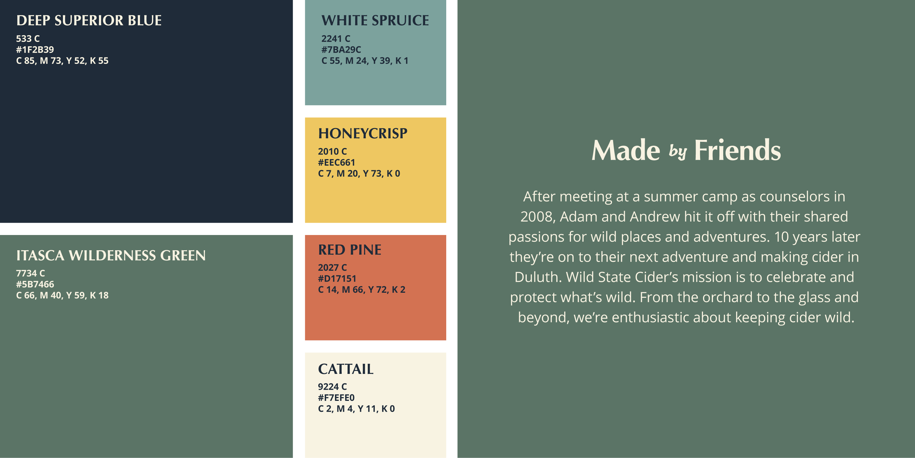
Made by Friends
Adam, Drew and I met while working at summer camp in the late 2000s and hit it off with our shared passions for wild places and adventures. Years later, Adam and Drew teamed up to create a cidery in Duluth Minnesota and asked me and my design partner to develop the look and feel of their brand.
When he approached us about this project, Adam already had a strong vision with a large amount of research and planning under his belt. He needed someone to help him hone in on the brand visually. The Wild State Cider mission was—from the beginning—to bring people together, to celebrate the outdoors and to protect what’s wild.
Melody and I were stoked to work on this brand and focused on the outdoorsy side of Duluth. We wanted to create a brand that felt local but could scale beyond northern Minnesota so anyone drinking Wild State Cider could feel at home celebrating the wild.
My Roles
branding, logo design
Tools
Adobe Illustrator, Adobe Photoshop, Adobe InDesign
Duration
4 months
Collaborators
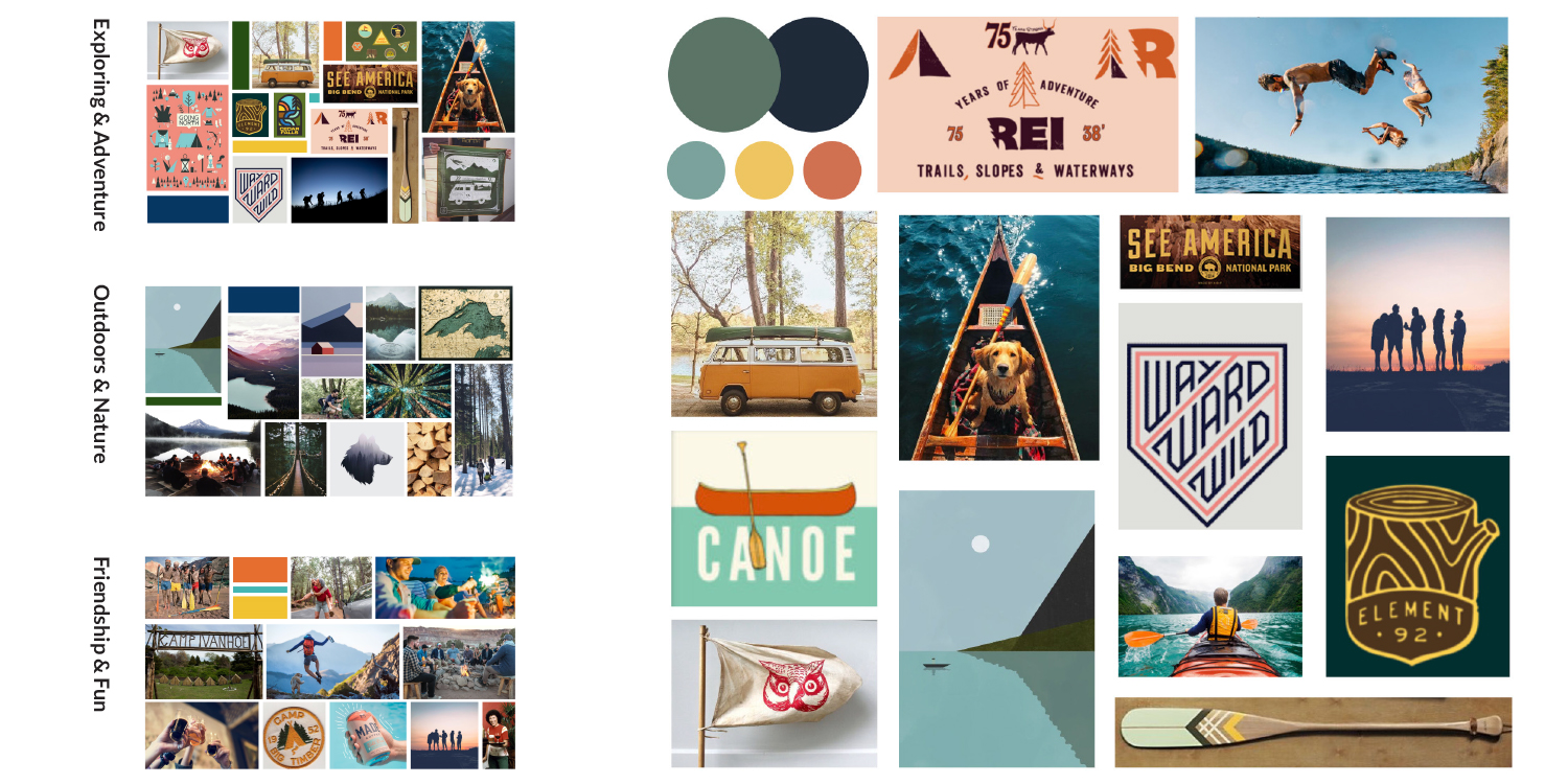
Tonal Territories & Moodboard
After weeks of discussion, we narrowed focus on three primary categories that drive the Wild State Cider brand:
- The action and exhilaration of Exploring & Adventure
- The space of the Outdoors & Nature
- The welcoming vibe of Friendship & Fun.
To establish visual agreement, we created three mood boards of these general tonal territories. The boards on the left were the visual jumping off point for the next branding stages.
The moodboard on the right was created from the tonal territories as a single visual guide for the brand. Anything created for the brand will reference this board as a source of inspiration and visual direction.
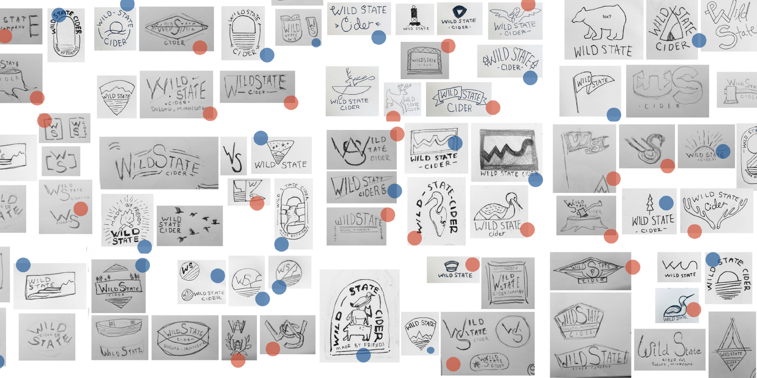
Logo Development Process
The client wanted to be intimately involved in the logo development process. To bring structure to this, we allowed for a few rounds of feedback, narrowing and editing after starting with many different of options.
Round 1: Initial Sketches
We sketched with the intention of showing a wide range of ideas as Adam didn’t have anything specific in mind. We has him add blue circles to the sketches he was drawn to and red circle to what he wasn’t—discussing aspects of his favorites and least favorites.
Round 2: Grouping and Refinement
We grouped sketches from round 1 that had a similar vibe. To supplement the visuals, small look & feel boards were created for each sketch group.
Round 3: Narrowing and Refinement
Digital roughs in this round were designed in grayscale however we incorporated color through mockups of the remaining logo concepts.
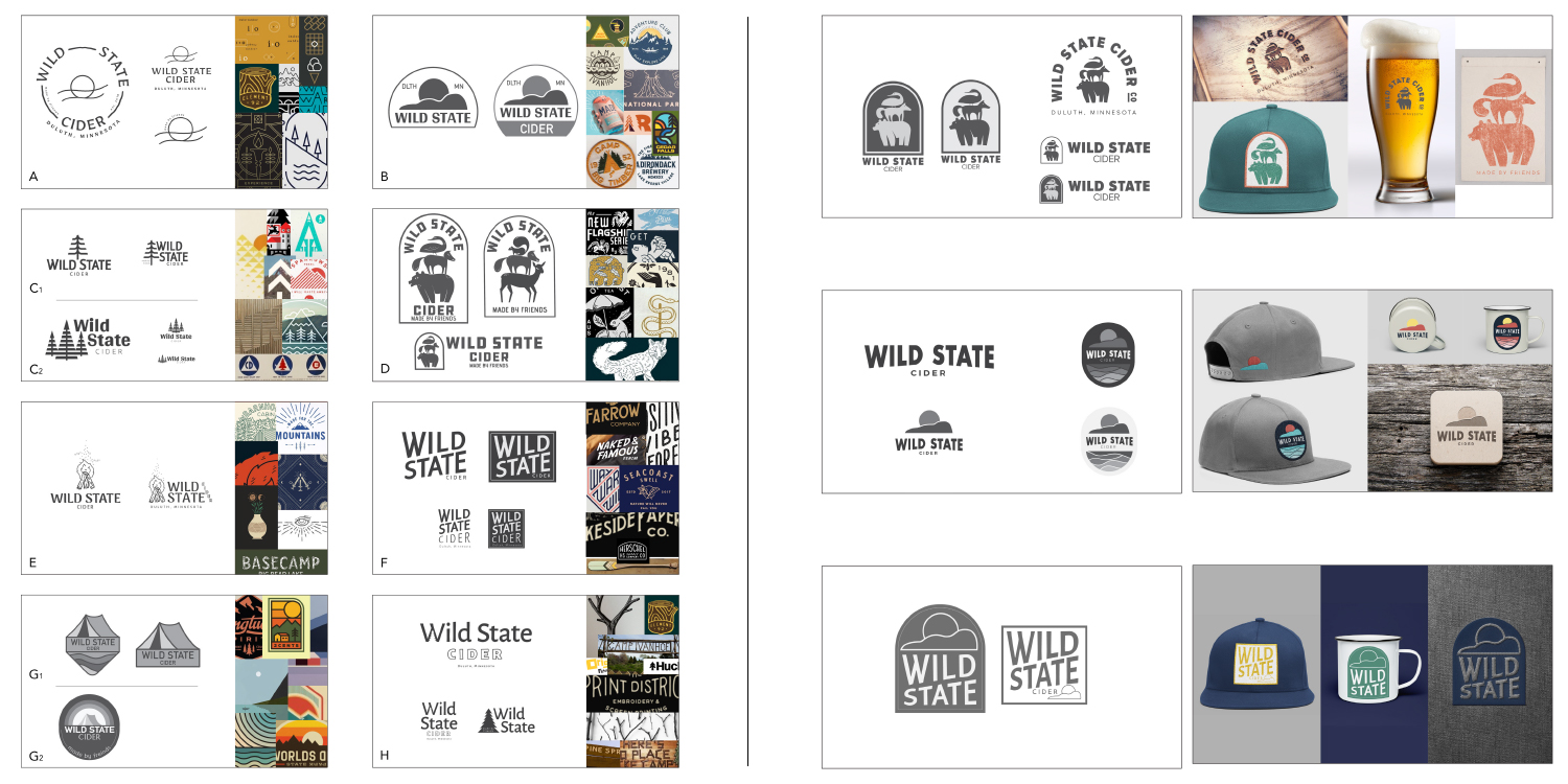
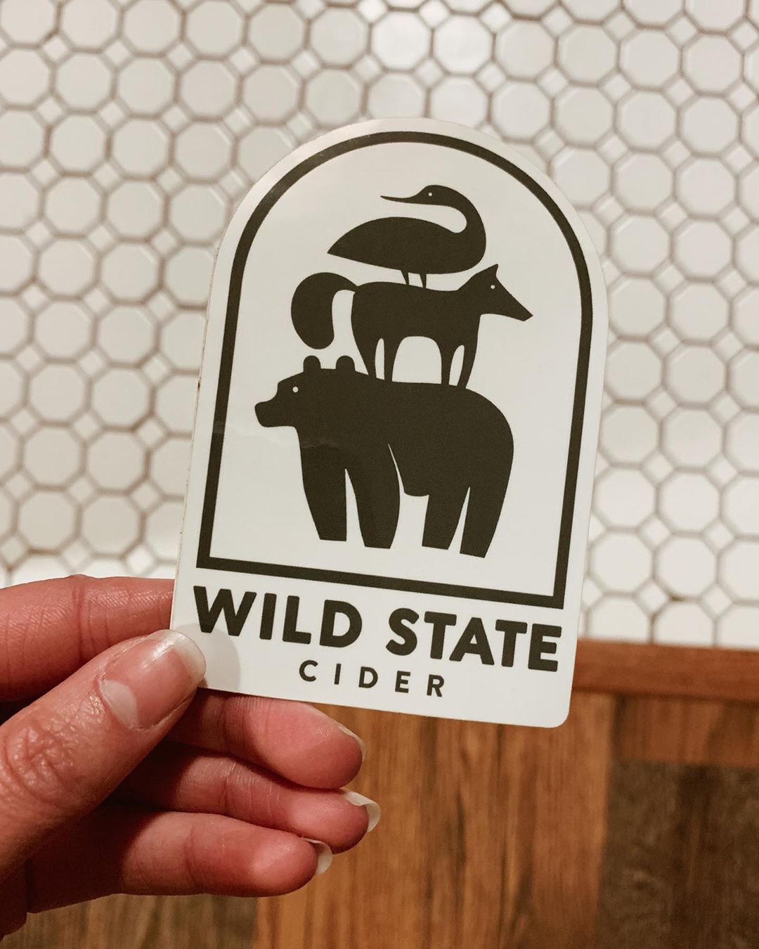
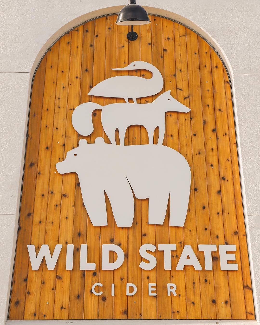
Final Logo
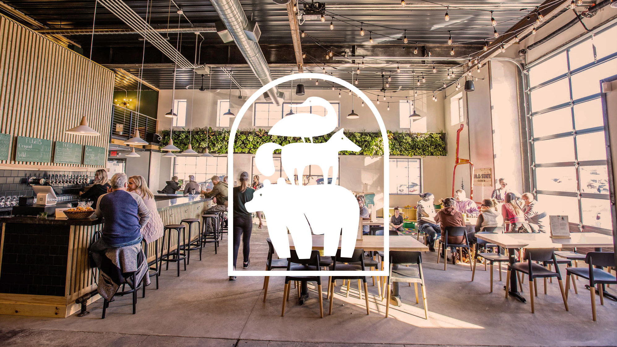
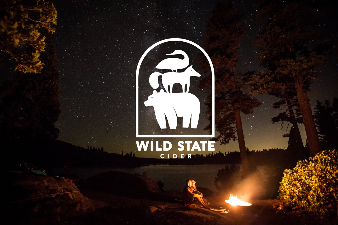
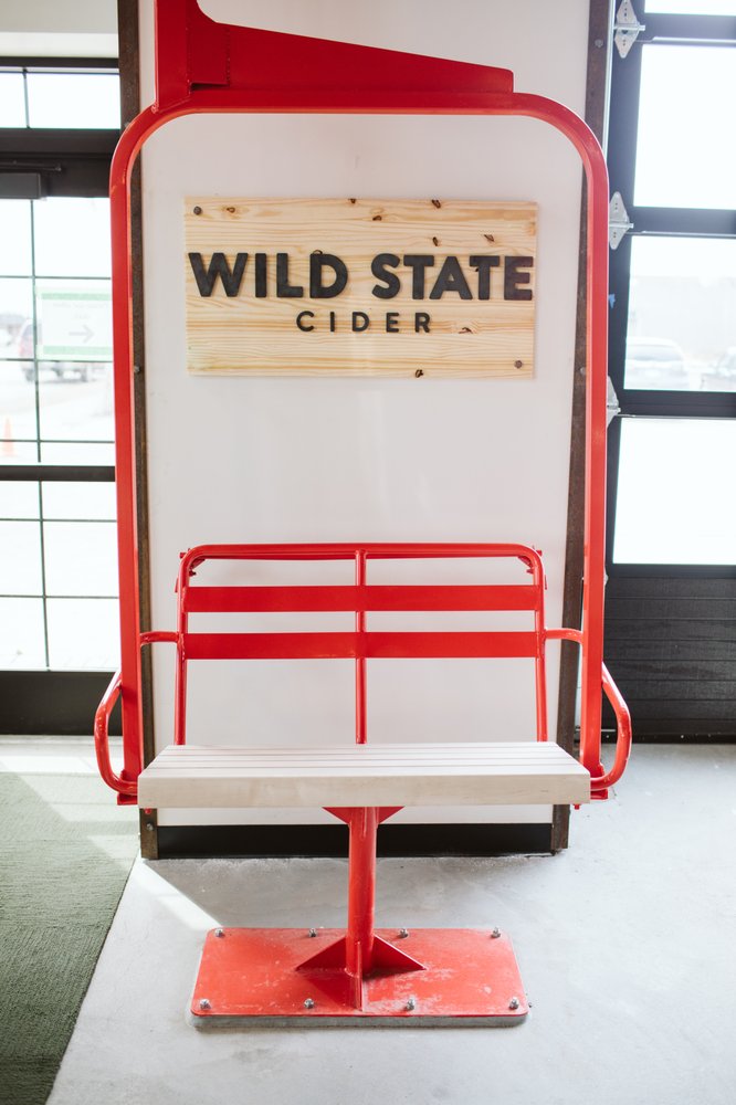
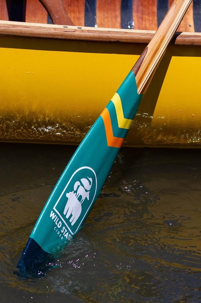
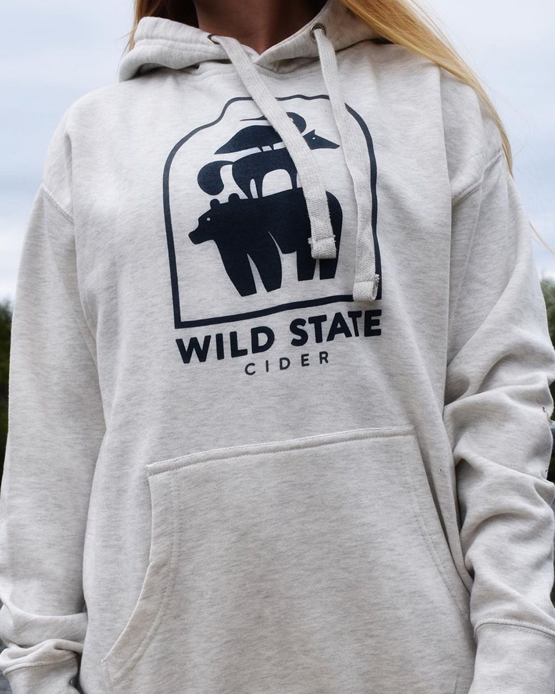
With some type refinement and illustration tweaking, the client decide on the stacked animals logo. This logo touches on the brand pillars of friendship, fun, the outdoors and adventure. The incorporated archway is a reference to a structural part of the building the client converted into the cidery.
The type is custom but has its base forms derived from Avenir, Brandon Grotesque, and Proxima Nova.
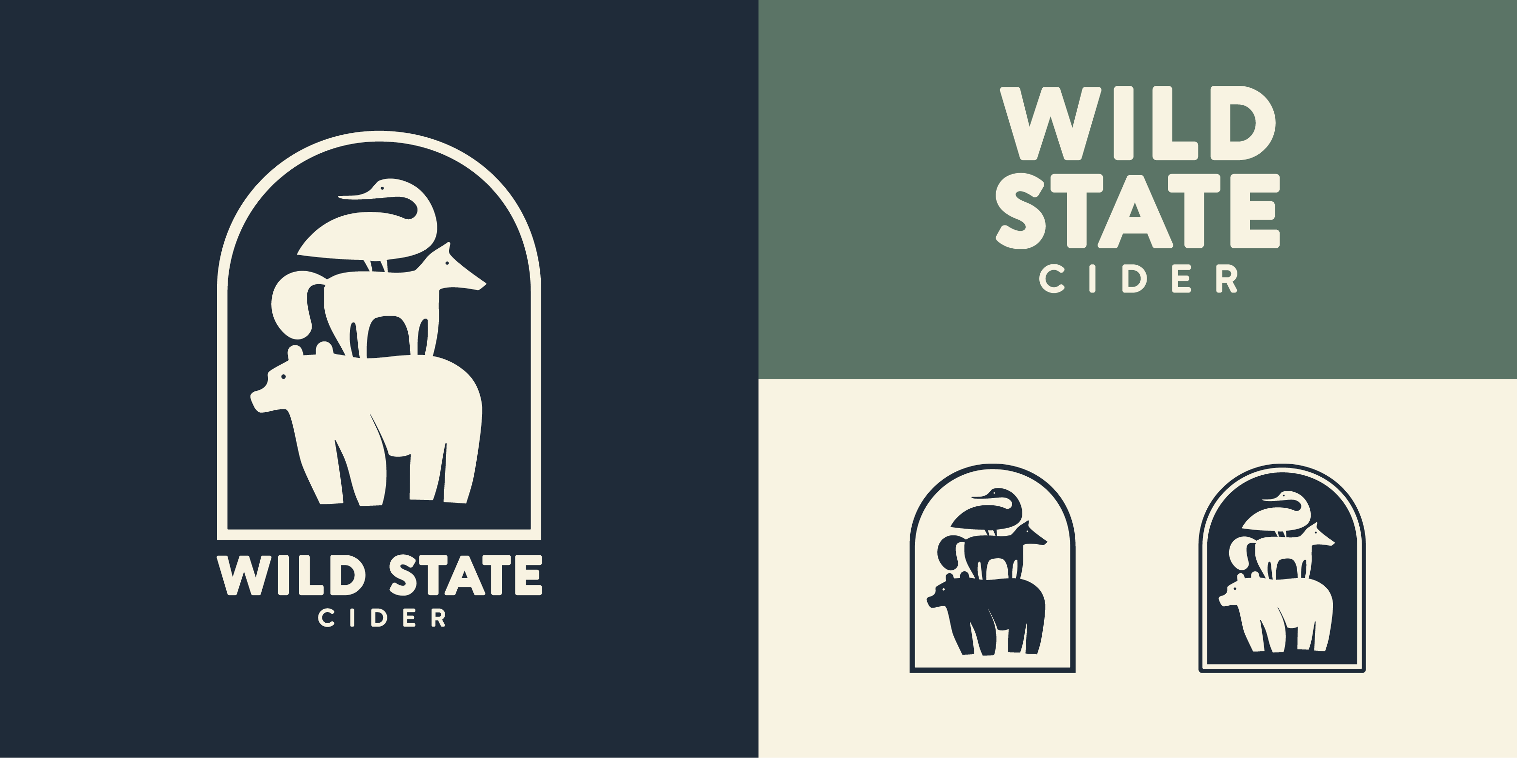
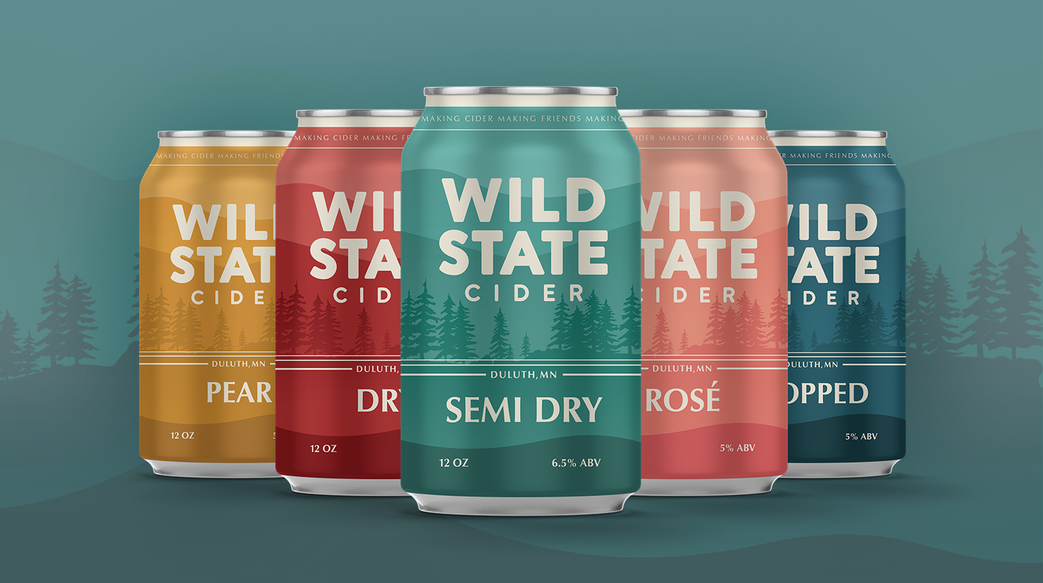
Color and Type
Color paints life onto a brand. There are two foundational colors and four supplementary colors that can be mixed and matched in a variety of ways to create fun and compelling designs.
Type is an incredibly important part of any brand. We chose a humanist sans typeface for headlines and titles called URW Classico. It’s a perfect nod to the cleanliness of sans serifs but with a little personality that brings life into the brand. The body and companion type is Open Sans. An easily readable typeface that has a wide variety of fonts to choose from for any particular need.
We added a playful supplementary typeface called Tillana to give the brand a bit of fun when needed, seen below in the title word “by.”
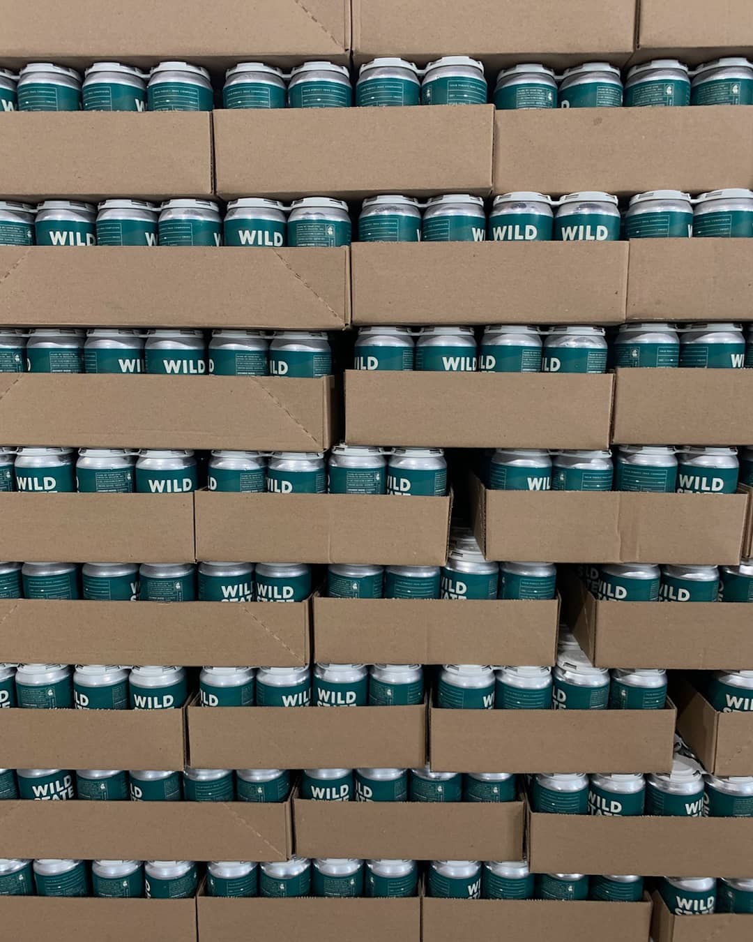
Cans
Apparel
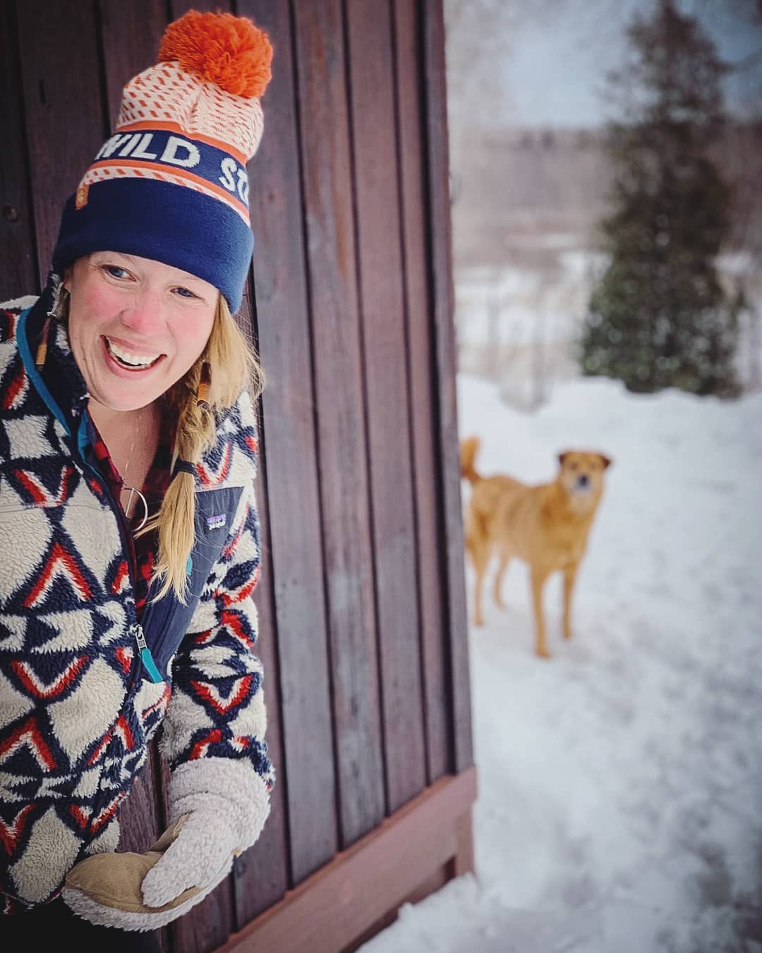
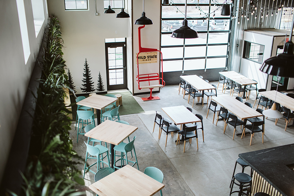
Environmental